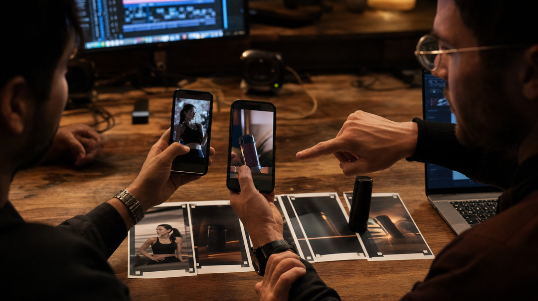
The edit looked finished on the desktop.
Then it hit the phone.
The opening hand revealed the product exactly on cue. The founder line landed clean. The offer text felt restrained. Then the platform chrome arrived: captions, profile chip, CTA bubble, progress bar, and the little stack of interface elements viewers hardly notice consciously anymore.
Now the fingertip that proved texture is hidden. The comparison line sits behind subtitles. The lower-third promise is fighting the auto-captions instead of helping them.
Nothing is technically broken. The ad just stopped proving the one thing it was supposed to prove.
That is how a surprising amount of premium AI short-form work dies.
Not in the hook. Not in the render. In the bottom third of the screen, where the interface becomes part of the composition.
The phone interface is part of the ad, not just the container
A vertical ad does not live inside a clean frame for more than a second.
The real frame is the combination of:
your video,
the platform UI,
the caption treatment,
the subtitle block,
the CTA or shop surface,
and the viewer's thumb hovering exactly where product proof often sits.
Treat those as separate layers and you get pretty edits that fail in market.
Treat them as one composition and the review gets much sharper.
Take a skincare demo. In Premiere, the hero moment is a close shot of serum spreading across a cheekbone with one line of on-screen copy near the bottom: "same glow, less routine." On the phone, auto-captions drop over the spread, the shop CTA covers the lower bottle edge, and the only visible proof becomes a smiling face plus a claim.
The ad still looks current. It just no longer earns the claim.
For a coffee machine, the collision may happen where the steam texture sits. For a SaaS founder ad, it may hide the exact workflow state on screen. For an apparel reel, it may cover the waistline or hem behavior that tells the buyer whether the fit is honest.
Different category, same commercial failure. The interface covered the proof faster than the team reviewed it.
Build a bottom-third map before you cut the batch
Moodboards are not enough for vertical paid work.
Before the team exports variants, it needs one bottom-third map for the asset family.
That map should define:
where the critical proof is allowed to live,
which zones may carry captions,
which zones must stay clear for platform chrome,
how high the first important hand, product, or screen state has to sit,
when the opening may use text and when the frame has to carry the message alone,
and which placements need their own crop instead of a last-minute recenter.
This is not over-engineering. It is what stops one good master shot from becoming six weak mobile exports.
Imagine a premium kitchen appliance launch. The hero frame shows the machine, the operator hand, and the first real foam result. If that foam proof lands too low, every Stories, Reels, and TikTok variant will spend its first second arguing with captions and buttons.
The fix is not "move the subtitles up a bit" after export. The fix is deciding before generation and edit that proof must live above the danger band.
That same rule changes how you shoot and prompt.
A founder direct-to-camera setup may need the face a little higher and the product handoff closer to center. A product demo may need wider negative space at the sides so the main action can sit safely above the caption pressure. A software scene may need a larger physical monitor in frame because the lower portion of the workflow cannot be trusted to stay visible on device.
This is the same translation problem described in An Organic Winner Is Not a Paid Ad Yet, just lower in the frame and easier to miss.
Once that map exists, versioning becomes safer. Without it, every variant keeps rediscovering the same mistake.
Run four pressure tests before you scale spend
A vertical ad should not be approved from the clean timeline alone.
It needs pressure.
1. Caption-pressure test
Turn sound off. Add realistic subtitle density. Use the actual pacing the ad will carry in market.
Now ask a blunt question: Can the viewer still understand the proof if the subtitle block sits on the busiest lower area of the frame?
Example: A beauty ad says, "You can see the texture settle, not mask." If the subtitles cover the exact settling moment, the line becomes unsupported poetry.
2. CTA-collision test
Mock the shop button, learn-more CTA, or lead form entry where it will actually live.
For an ecommerce ad, that might hide the bottom of the pack, the price cue, or the decisive hand gesture. For a service ad, it might cover the screen state that makes the promise believable.
If the CTA covers the only honest proof, the ad is not ready. Move the composition, not just the button in your imagination.
3. Thumb-stop to proof travel
Count the distance from the first arresting frame to the first undeniable proof. On vertical paid placements, that distance has to stay short.
If the ad opens with face, motion, or mood but needs another two beats before the product, workflow state, or comparison becomes readable, the interface often steals the moment first.
This is where a lot of polished founder and creator ads go soft. They win attention upstairs and hide evidence downstairs.
4. Placement fork test
Do not assume one 9:16 export solves Stories, Reels, TikTok, and short-form paid in the same way.
The UI stack, caption behavior, and viewing context shift just enough that one approved vertical master can still fail on one surface.
A fitness supplement ad may survive on Stories with clean top-aligned copy, then fail on TikTok when auto-captions and account chrome pile into the only proof zone near the shaker and hand.
That is when the adult move is to fork the placement, not defend the master.
If the team skips this step, it usually also skips the learning loop described in The Review Cadence That Keeps Short-Form Content From Becoming Sludge.
Some shots cannot be saved by recropping
Teams lose time trying to rescue frames that were never built for mobile pressure.
A beautiful horizontal product-film still can produce useful mood assets, but it may never become a strong vertical paid proof frame if:
the decisive product action happens too low,
the hands and object need more vertical room than the crop can preserve,
the message relies on a lower-third text layer,
or the screen demo becomes unreadable once the phone UI takes its share.
This is where a vertical-first reshoot or regenerate is cheaper than endless edit compromise.
A fashion brand might have one gorgeous waist-up portrait for the launch hero. That frame can work on the landing page and email. It may be the wrong source for TikTok paid if the fit clue lives in the hem, hip line, and full-body stance that disappear the second the frame gets centered for mobile UI.
A software brand might love one desk-shot founder take. If the real proof is the state change on the laptop screen, a cleaner fix may be to build a new vertical composition with the screen higher and the speaking role tighter, rather than keep shrinking captions and hoping.
Not every asset deserves every placement.
That is not inefficiency. That is art direction.
The settings and constraints that matter first
Different tools expose different controls, but the same vertical-ad controls matter across workflows.
Subtitle density
Shorter lines are not only a readability choice. They change how much of the proof gets buried.
Proof anchor height
Decide where the critical product or interface moment must sit. Do not let generation or edit drift it down into UI traffic.
Text hierarchy
Choose which message belongs in speech, which belongs in captions, and which belongs nowhere in the first cut. When all three layers say different things, the ad feels busy and less trustworthy.
Placement-specific crops
Approve crops per surface, not one abstract master. A paid TikTok cut, a Reels ad, and a Stories variant often need different compromises.
On-device review
Always review on an actual phone with realistic caption treatment, not only in a clean desktop preview. Desktop approval hides mobile collisions the same way beautiful stills hide paid-social compression.
What Gateway Studio should remember after review
Vertical paid work gets expensive when the team forgets which proof survived the interface.
Gateway Studio should keep:
the bottom-third map for the asset family,
approved subtitle treatments,
placements that needed their own crop,
rejected versions and exactly what the UI covered,
proof frames that still held with sound off,
safe and unsafe text positions,
and the point where a vertical-first reshoot became smarter than another export pass.
That memory matters because bottom-third mistakes are sneaky. Teams rarely notice them in the room. They notice them later, when comments ask the obvious question or the paid cut clicks without convincing.
The next campaign should not relearn that lesson from zero.
The useful approval question
Before a vertical AI ad gets budget, ask one non-stylish question:
If captions, platform chrome, and the CTA landed on this frame right now, would the proof still survive?
If the answer is no, the ad may still be beautiful.
It is just not ready for the phone yet.
Because the real frame includes captions, platform UI, CTA surfaces, and thumb behavior, not only the exported video. A proof moment that felt clear on desktop can become unreadable once those layers land on the lower part of the screen.
Next move