Most launches do not fail because the team made too little content.
They fail because one asset is being asked to do three different jobs at once.
The homepage hero is expected to create desire, the product film is expected to explain everything, and the paid ad variant is expected to close every objection in six seconds. When that happens, the launch starts to feel confused before anyone says it out loud. The visuals may look polished in isolation, but the buyer does not know what to trust, what to remember, or what to do next.
That is why launch visuals need role clarity, not just visual quality.
The useful question is not whether the brand needs more assets. The useful question is whether each asset has one clear commercial job.
The expensive mistake is making one frame do everything
Teams often approve a strong hero visual and then try to stretch it everywhere.
The same image gets cropped for the website, repurposed for ads, reused in email, and treated like it can carry the entire launch. That shortcut is attractive because it feels efficient. In practice, it weakens the system.
A hero image is not a product explainer.
A product film is not a paid social hook.
An ad variant is not the full visual world of the launch.
Each asset belongs to a different moment in the buyer journey:
the hero image should make the launch feel premium and trustworthy at first glance,
the product film should show behavior, material logic, sequence, or transformation,
the ad variant should isolate one angle for one audience in one placement.
When those roles blur together, the launch becomes visually busy but commercially vague.
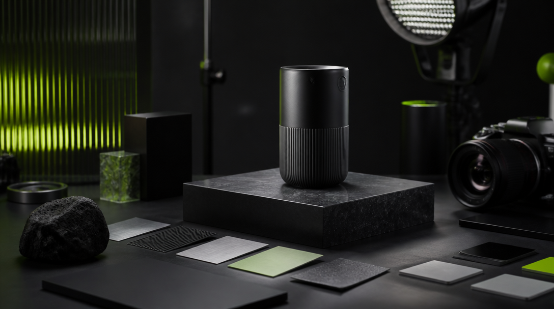
1. The hero image should create trust and desire fast
The hero image has a simple but demanding job: make the brand feel intentional before the audience reads much at all.
That means the hero is carrying first-impression work:
premium perception,
product desirability,
launch mood,
visual confidence,
trust that the brand knows what it is presenting.
The hero does not need to teach every feature. It needs to make the product or offer feel worth inspecting.
This is where teams often over-explain. They crowd the frame with too many props, too much concept symbolism, or too much platform thinking. The result is an image that may look “creative” but does not feel commercially grounded.
A strong hero image usually does three things well:
It gives the product believable physical presence.
It creates a controlled emotional tone.
It leaves enough visual simplicity for the rest of the launch system to build on.
If the hero looks synthetic, cluttered, or over-performed, the launch starts with a trust tax. The audience may not consciously name it, but they feel it.
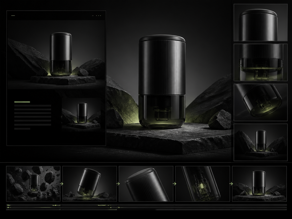
2. The product film should explain behavior, sequence, or proof
The product film has a different role.
It is not there to repeat the hero frame with movement. It is there to answer the questions a still image cannot answer cleanly:
How does the product behave?
What changes when someone uses it?
What material or functional detail matters?
What sequence makes the offer feel credible?
What emotional rhythm supports the launch?
This is why product film belongs in the middle of the visual system, not as an afterthought.
A still image can create desire. A film can create understanding.
The film does not need to become a full brand movie unless the launch actually needs that scale. In many launches, the strongest product film is compact and precise. It shows texture, handling, transitions, proof of use, or one decisive before-and-after shift. It gives the audience a reason to believe the product exists in a real world.
The common mistake is turning the film into visual wallpaper. Beautiful shots, shallow meaning.
If the film does not answer a practical buyer question, it becomes expensive mood instead of useful proof.
3. The ad variant should isolate one angle, not summarize the launch
Ad variants work best when they are narrow on purpose.
One audience. One angle. One commercial tension.
That might be:
the biggest objection,
the clearest product benefit,
the strongest founder-led point of view,
the most persuasive use case,
the launch hook with the fastest comprehension.
What the ad variant should not do is carry the entire launch architecture.
When teams try to compress hero mood, product explanation, brand world, every proof point, and every CTA into one paid asset, the output gets noisy fast. It stops feeling precise and starts feeling desperate.
The stronger method is to treat ad variants like testing units:
one claim,
one hook,
one crop logic,
one placement context,
one hypothesis about what the audience will respond to.
That makes the campaign easier to review and easier to improve. The media team can learn from it. The creative team can tell what changed. The brand team can see what is still on-brand and what is drifting.
Build the asset ladder before production starts
The cleanest launches are usually decided before generation, not after it.
Before anyone starts making frames, define the asset ladder:
Hero image
Where will it live first?
What emotion should it create?
What must the viewer trust in the first two seconds?
Product film
What behavior or transformation needs motion?
What proof does still photography fail to show?
What sequence creates clarity without bloat?
Ad variants
Which audience or objection is each variant for?
Which placements matter?
What is the shortest route to understanding?
This planning step is where launch systems get more premium. Not because the brief becomes longer, but because the decisions become cleaner.
Where AI helps and where it still needs boundaries
AI is useful in a launch asset system when it reduces production drag without erasing judgment.
It can help with:
concept exploration before the final direction is locked,
hero image variants for different landing page or social contexts,
product scene exploration before a physical shoot exists,
ad creative branches built from one controlled visual world,
fast iteration on crops, compositions, and scene language.
But AI does not remove the need for boundaries.
Real capture is still the better path when the launch depends on exact material proof, regulated claims, measured scale, or tactile accuracy that the audience must trust literally. The smartest launch systems do not ask AI to win every job. They ask it to speed up the jobs where controlled flexibility matters more than forensic physical truth.
That is the difference between using AI as leverage and using AI as a fantasy shortcut.
The review checklist for a launch visual system
Before approval, ask three role questions:
Does the hero image make the product or offer feel worth attention?
Does the product film answer a buyer question that the hero cannot answer?
Does each ad variant isolate one angle clearly enough to test, learn, and scale?
Then ask three system questions:
Do the assets feel like one launch world rather than three unrelated directions?
Is the proof load placed in the right asset type?
Can the team explain why each asset exists without using vague language?
If the answer is no, the issue is usually not aesthetic talent. It is role confusion.
A stronger launch feels coherent before it feels loud
Premium launches rarely win by shouting the most.
They win by making each visual asset do the right job at the right moment.
The hero image earns the first glance.
The product film carries behavior and proof.
The ad variant sharpens the message for placement and testing.
That is how the launch starts to feel coherent, reviewable, and commercially usable instead of simply busy.
Not always, but every launch does need clarity on which asset handles first impression, which one carries proof or behavior, and which one is built for paid testing or placement-specific performance.
Next move