Many landing pages try to solve weak trust with more sections.
More process. More benefits. More logos. More explanations.
Sometimes the page does not need more material. It needs better proof in the first movement.
For a creative studio, motion proof is often stronger than another paragraph.
The first scroll should prove control
A premium landing page has to show that the studio can direct attention.
That happens before the visitor reads every service detail.
The hero frame, the transition into the next section, the way media moves, and the rhythm of the first scroll all create a signal: this team understands pacing.
If the motion feels generic, the offer feels generic.
Motion is not decoration
Bad motion says, "Look, the page moves."
Good motion says, "This work has a point of view."
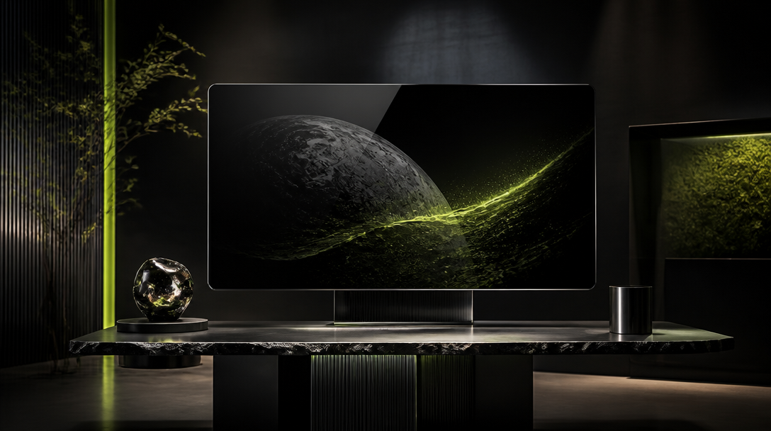
It can reveal a campaign frame, compare before and after direction, show product material under controlled light, or make an archive feel like a curated studio wall.
The motion should carry evidence.
If it does not prove something, it should probably be quieter.
Replace section count with proof density
The question is not how many sections the page has.
The question is how much trust each screen earns.
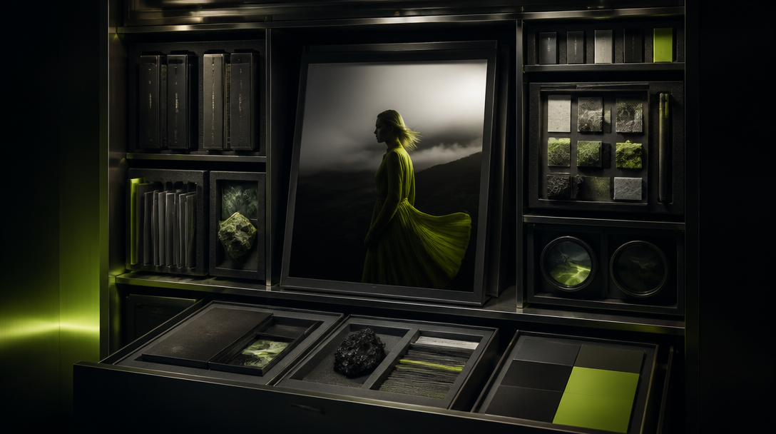
A strong creative landing page can use fewer sections if every screen contains proof:
a real frame,
a clear service promise,
a visible standard,
a reason to believe,
a direct path to contact.
That is proof density.
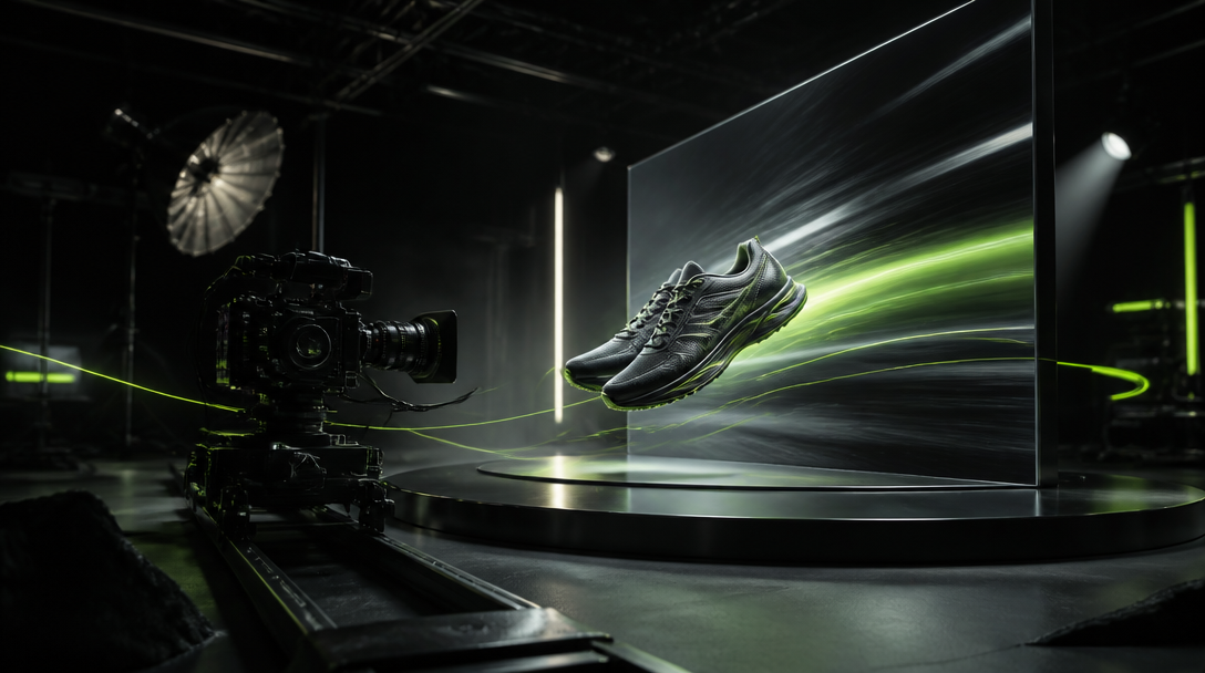
The video has to be composed for the page
Dropping a portfolio video into a web page is rarely enough.
The video should be designed for the container. Cropping, loop point, contrast, first frame, loading state, and mobile framing all matter.
The best page video behaves like part of the interface. It does not ask the visitor to stop and watch. It gives the page authority while the visitor continues moving.
Keep the system fast
Motion proof fails if it makes the page feel heavy.
The production system should include:
compressed web-first video,
a strong poster frame,
predictable aspect ratios,
no layout shift,
a fallback that still looks premium,
mobile framing checked before launch.
The user should feel the work, not the loading strategy.
The first screen has one job
A visitor considering a premium creative service is not only asking, "What do you offer?"
They are asking, "Do I trust this team's taste and control?"
The first screen has to answer that question quickly. For an AI creative studio, this matters even more because the market is full of work that looks impressive for two seconds and then starts to feel generic.
Strong first movement can show:
how the studio handles pacing,
how it keeps the product or brand in focus,
how it uses AI without making the work feel cheap,
how quickly the offer becomes understandable,
how clearly the page leads to the next action.
If the first screen cannot earn trust, the rest of the page has to work too hard.
Motion does not have to be loud
A premium site does not need constant animation.
Sometimes the stronger choice is a slow image shift, a precise transition between two frames, or a restrained reveal of the service system.
Loud motion ages quickly. Quiet, exact motion lasts longer because it does not feel like a trick. It feels like direction.
That is the difference between an effect and proof.
When to add a section and when to improve motion
Add another section when the page is missing information: pricing context, process, examples, scope, FAQ, or social proof.
Improve motion when the page is missing a feeling of control.
If the visitor understands the offer but still does not believe the quality, another paragraph rarely solves the issue. They need to see the standard. They need to feel that the team can direct visual rhythm.
The best pages use both layers: copy explains the commercial logic, while image and motion prove the creative level.
Closing thought
More sections can make a weak landing page longer.
Motion proof can make a focused landing page more believable.
For a studio selling visual judgment, that is usually the better trade.
No. For a creative studio, motion should prove pacing, taste, and control before the visitor reads every detail.
Next move