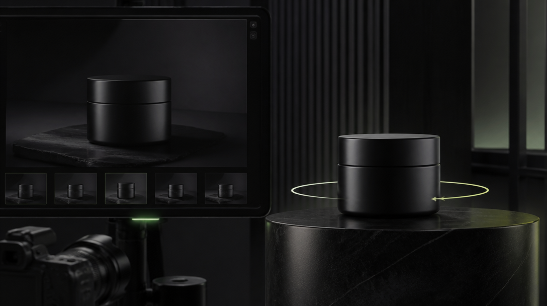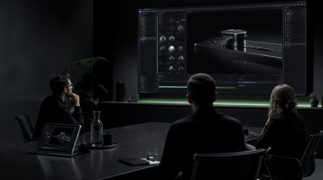
AI product demo videos are getting easier to make.
That is not the same thing as getting easier to trust.
The moment a brand puts an app screen, dashboard, checkout flow, or product interaction into motion, the viewer starts reading the interface like evidence. They assume the sequence means something real. They assume the feature exists in that form. They assume the copy, timing, and screen behavior belong to a product that actually works that way.
That is why the useful product-demo question is not "Can AI make this look polished?"
It can.
The useful question is whether the interface is still true once motion, transitions, camera framing, and visual styling have been added.
If the interface stops being true, the video may still look premium, but it stops doing honest commercial work.
Product demo video is not the same as concept mood video
Many teams mix these jobs together.
A concept mood video can tolerate abstraction. It can suggest a product world, a design taste, or a future direction without asking the viewer to believe every detail literally.
A product demo video is different.
It usually has to do at least one of these jobs:
prove a real feature exists,
show how the product behaves,
reduce buyer confusion,
support a launch, ad, or sales conversation,
or make a complex product feel easier to understand.
That means the interface is no longer decoration.
It becomes a proof surface.
Once the screen is acting like proof, UI drift is no longer a small visual mistake. It becomes a trust problem.
The first mistake is asking one AI video to do every product job
Weak product demos often fail before generation even starts.
The team wants one asset to be:
a beautiful brand film,
a feature explainer,
a high-conversion paid ad,
a founder story,
and an onboarding walkthrough
all at once.
That pressure usually creates fake UI behavior.
The motion becomes too dramatic. The product steps get compressed beyond clarity. Labels move too fast to read. A clean interaction turns into spectacle. The viewer sees a polished surface but cannot tell what the product actually does.
The better move is to assign one job first.
Examples:
one six-second feature proof for paid social,
one landing-page hero loop that communicates ease, not detail,
one controlled onboarding moment for a launch film,
or one sales-support cut that clarifies a specific product action.
Once the job is clear, the team can judge whether the interface needs precision, suggestion, or a hybrid of both.
Lock interface truth before you animate anything
For product demos, the main control layer is not the prompt.
It is the truth pack behind the prompt.
Before the first render, lock:
the real product flow the video is allowed to represent,
the exact screen states that matter,
the feature language that must not mutate,
the UI hierarchy that must stay legible,
the device or frame context the viewer should believe,
and the claim boundary the video must not cross.
This matters because AI likes to "help."
It can invent a cleaner chart, a nicer dashboard card, a more cinematic transition, a more dramatic cursor path, or a more elegant product state than the one the real software currently supports.
That help is exactly what can make the demo dishonest.
If the product does not really behave that way, the polish becomes fiction.
What usually breaks first in AI product demo videos
The failure pattern is more predictable than teams expect.
1. Copy drift
Buttons, labels, plan names, claims, chart headings, and microcopy start changing between shots or become unreadable.
That is not a cosmetic issue.
If the product message changes while the sequence moves, the viewer loses confidence in the whole explanation.
2. Interaction drift
The cursor clicks things in the wrong order. Panels open faster than a human could follow. States appear without a believable transition. A workflow looks magical instead of usable.
In a mood video that might be acceptable.
In a product demo it quietly weakens credibility.
3. Device-context drift
The interface looks like desktop in one shot and tablet in the next. Browser chrome disappears and returns. Proportions stretch. Depth-of-field styling makes the product feel like a poster instead of an actual tool.
When the container shifts, the product truth shifts with it.
4. Feature inflation
The video implies the product does more than it really does.
Sometimes this happens through invented data views. Sometimes through too-clean automation flows. Sometimes through smart-looking panels that suggest capability the roadmap has not earned yet.
This is the most dangerous kind of drift because it can create false expectation before the buyer ever books a call or starts a trial.
What to test first
The first test should be narrow on purpose.
Do not start with a full product film. Start with one proof moment.
The best first probe is usually:
one real flow from the product,
one camera treatment,
one duration,
one rejection rule set,
one placement context.
For example:
one signup confirmation moment,
one dashboard insight reveal,
one before/after workflow change,
or one product action that reduces confusion instantly.
Then review it against five questions:
Is the interface still the real product?
Is the copy still true and legible?
Is the interaction believable at human speed?
Does the placement need more explanation or less?
Did the video imply any feature the team did not approve?
That review order matters.
Most teams start with "Does it look good?"
That is too late in the logic.
For product demo work, truth has to come before beauty.
Settings matter after the truth pack is clear
Once the control layer is locked, then settings become useful.
The first variables worth testing are usually:
reference strength,
duration,
transition intensity,
camera simplicity,
crop safety,
and how much environmental styling is allowed around the interface.
What usually helps:
shorter clips,
stronger reference authority,
simpler motion,
cleaner screen composition,
and one proof action per shot.
What usually hurts:
cinematic language before screen truth is protected,
heavy reflections or effects over important UI areas,
too many transitions in one clip,
vague "futuristic SaaS" prompting,
and compressing a multi-step product flow into one impossible gesture.
The strongest product demo settings are rarely the flashiest ones.
They are the ones that keep the product understandable.
When AI is the right layer and when real capture should lead
AI can be a very strong layer for product demo work when:
the goal is a controlled hero loop,
the product already has approved screens,
the sequence needs clarity more than literal click-by-click proof,
the team wants a premium frame around a true interaction,
or one product moment needs multiple placement variations fast.
Real capture or hybrid capture should lead when:
the UI must be literally exact,
legal or regulated claims are visible,
pricing, settings, or dashboards could be interpreted as promises,
the product interaction itself is the proof,
or the buyer will inspect the screen closely before purchase.
That is not a failure of AI.
It is a routing decision.
Serious product teams do not ask one generation method to solve every proof problem.
They route each asset to the right level of truth.
What Gateway Studio should own
If product demo video is going to scale without repeating the same mistakes, someone has to own the memory.
Gateway Studio should hold:
approved screen captures and flow references,
exact claim boundaries,
allowed stylization zones,
rejected shots and why they failed,
placement-specific crops,
review notes from product, marketing, and legal owners,
and the final rule for when a demo can stay AI-led versus when it must move to hybrid or real capture.
That turns demo production from a series of isolated experiments into a system.
Without that memory, teams keep paying for prettier versions of the same drift.
The practical conclusion
AI product demo video becomes commercially useful when the interface stays honest.
Not when the motion gets louder.
Not when the screen looks more futuristic than the product.
Not when the workflow becomes too polished to be true.
The premium move is simpler:
protect the real interface, test one proof moment first, route high-risk screens carefully, and let Gateway Studio keep the approval memory that protects the next round.
That is how product demo video starts helping a brand instead of quietly overpromising for it.
Because the viewer reads the interface as evidence. If the sequence invents copy, states, feature behavior, or impossible transitions, the demo may still look polished but it weakens trust in what the product actually does.
Next move