Many teams still talk about product realism as if it were an art-direction preference.
They ask whether the render looks premium enough. Whether the reflections feel cinematic enough. Whether the surface detail feels expensive enough.
Those questions matter.
They are not the main commercial question.
The main question is whether the buyer is reading the frame as evidence.
That is the moment realism stops being a visual taste debate and becomes a trust issue.
If the image is only setting mood, the brand has room for stylization. If the image is explaining the product, the frame needs more discipline. If the image is being read as proof of material truth, packaging detail, scale, finish, or use, weak realism starts quietly damaging credibility.
This is why some AI product visuals still fail even when they look polished at first glance. The problem is not that they look synthetic in some abstract way. The problem is that the product promise starts feeling unstable.
Buyers do not inspect every frame the same way
One launch usually needs several kinds of product frames.
They are not all judged by the same standard.
A campaign hero may be allowed to be atmospheric. A teaser crop can lean more editorial. A conceptual background scene can prioritize world-building over literal proof.
But the viewer reads other frames differently:
the close pack shot on a landing page,
the label crop inside a paid ad,
the hand interaction that implies scale or ergonomics,
the texture detail that suggests finish or quality,
the beauty, food, hardware, or packaging frame that looks like product evidence.
Those images are not only selling taste. They are carrying accountability.
Once a frame starts answering the unspoken question "is this what the thing really looks like?", realism becomes part of business trust.
The trust problem usually appears before anyone says "this looks AI"
Most weak product visuals do not fail because the room instantly calls them fake.
They fail more quietly.
The packaging curve looks slightly invented. The shadow logic changes from one crop to another. The cap sits differently between frames. The liquid behaves like a styling effect instead of a physical substance. The reflection makes the product feel like a new material. The hand contact does not quite belong to the object.
Each issue may look small on its own.
Together they create a worse outcome than obvious bad generation. They make the product feel uncertain.
That uncertainty is commercially expensive.
It weakens the trust of:
the buyer deciding whether the product is premium or cheap,
the media team deciding whether the asset can carry spend,
the founder deciding whether the visual still represents the offer honestly,
and any retail or internal stakeholder asking whether the image is presentation or evidence.
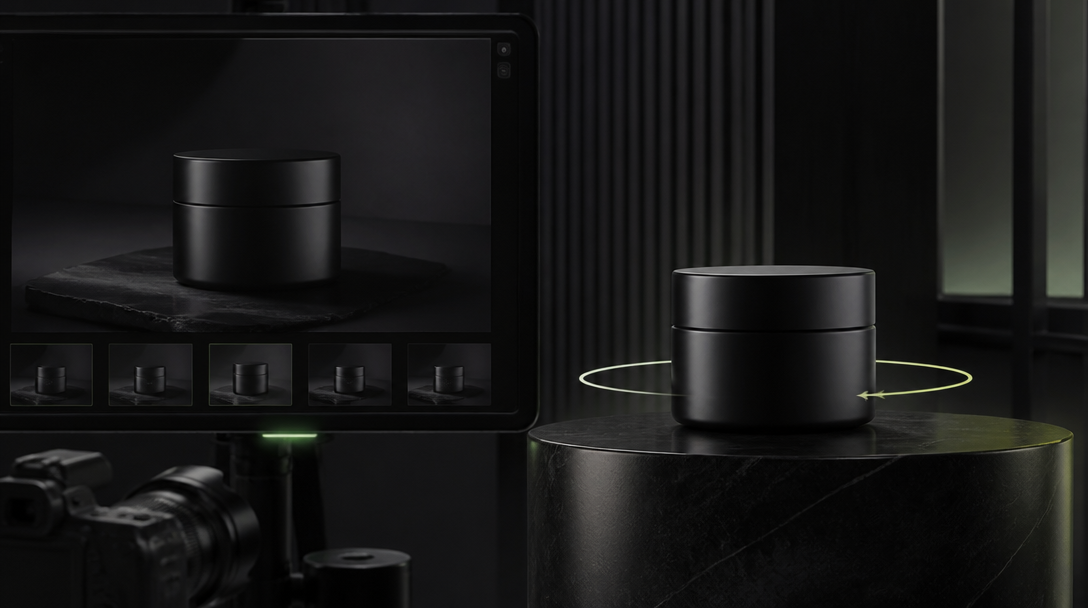
What to test first before you scale an AI product visual system
The first mistake is scaling variations before the realism threshold is known.
Do not start with twenty assets. Start with four proof-sensitive tests.
1. One hero product frame
Can the product hold its shape, silhouette, and material logic inside the brand world?
This is not yet the hardest realism test, but it reveals whether the object can survive lighting and composition without turning into a new SKU.
2. One packaging or label crop
Can the product stay believable when the viewer moves closer?
This test reveals whether edges, seams, label geometry, closures, typography zones, and brand marks stay stable enough for commercial use.
3. One hand or usage interaction
Can the product survive contact?
Many systems look acceptable until a hand picks up the object, presses a surface, pours a liquid, opens a cap, or holds the pack at a believable scale.
4. One paid-social crop
Can the frame stay trustworthy after compression, reframing, and hook-first cropping?
Sometimes the wide hero looks good, but the paid-social version exposes the exact realism weakness the main frame was hiding.
These four tests tell a brand more than a large gallery of loosely controlled outputs.
The settings and constraints that matter more than teams expect
When realism breaks, teams often blame the model too early.
The real issue is usually a weak control system.
For product work, Gateway Studio should lock these inputs before the next render round:
one approved hero reference for the exact SKU,
a short non-negotiables list for material truth,
one camera family instead of random framing drift,
one lighting lane per asset family,
one clear rule for what can stylize and what cannot,
a note about which details are proof-sensitive,
and rejection memory for the last failed outputs.
In practice, that means questions like:
must the label geometry stay literal,
can the glass become moodier than reality,
are micro scratches acceptable or harmful,
can the liquid be more dramatic than real life,
does the cap, pump, seam, zipper, or button placement have to remain exact,
and is this frame atmospheric, explanatory, or evidentiary?
Those constraints sound simple.
They are what stops "beautiful AI product art" from drifting away from "usable commercial product visual."
What usually breaks first
The weak points are predictable.
Teams should review them deliberately instead of waiting for vague discomfort.
The most common failure points are:
label distortion,
geometry drift between frames,
impossible reflections,
surface texture that changes by crop,
false thickness in glass or plastic,
invented hardware details,
wrong scale in hand interaction,
and packaging behavior that no real object would produce.
For beauty, food, and tactile consumer products, realism also breaks when substance behavior stops making sense. Cream, powder, liquid, condensation, fabric, and edible surfaces need their own review tolerance.
If the category sells through touch, finish, or material trust, realism has to be treated as a claim boundary.
What Gateway Studio should own in this workflow
Gateway Studio should not only store the generated images.
It should own the production memory behind realism decisions.
That means preserving:
the golden product reference pack,
approved and rejected lighting lanes,
proof-sensitive details,
allowed stylization zones,
forbidden claim zones,
asset-role labels,
handoff notes for paid-social crops,
review comments about what broke,
and the routing rule for AI-only, hybrid, or real capture.
This is the operational advantage.
Without that memory, the team keeps re-litigating realism from zero. With it, the system gets sharper every round.
The next asset does not start as another guess. It starts with a known trust boundary.
The practical routing rule
If the frame is mainly carrying mood, AI can usually lead.
If the frame is carrying explanation, AI can still lead, but only with tighter constraints and review.
If the frame is carrying proof, the team should pause and ask whether:
the exact detail must survive scrutiny,
the image implies a physical fact the brand would need to defend,
the product category has fragile trust around finish, packaging, or use,
a buyer could treat the frame as literal evidence,
and a hybrid or real-capture route would protect the commercial outcome better.
That is the useful decision model.
Not "AI or photography?"
But "what job is this frame doing, and how much truth does it need to carry?"
Closing thought
Product realism is not valuable because perfection is fashionable.
It is valuable because trust is expensive to lose.
The brand does not need every launch frame to behave like forensic proof. It does need to know exactly which frames are allowed to stylize, which frames must explain cleanly, and which frames are too trust-sensitive to fake.
That is where Gateway Studio becomes useful.
It turns realism from a vague visual complaint into a controlled production decision.
It is the point where a frame stops acting only like art direction and starts carrying believable product truth around shape, material, packaging, scale, or use. That is why realism has to be judged against the job of the asset, not as a vague aesthetic preference.
Next move