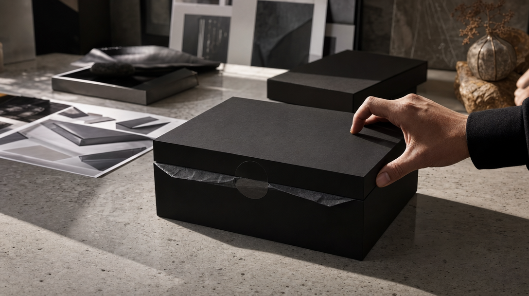
The box opened too easily.
In the first review cut, that sounded like a compliment. No snag in the peel tab. No awkward thumb fight. The lid lifted in one smooth move, the tissue floated apart, and the serum bottle rose from the tray like it had been waiting for applause.
Then the team slowed the shot down.
The tamper seal released without tension. The magnetic lid looked lighter than the paper insert underneath it. The fingers touched the ribbon after the tray was already moving. What was supposed to feel premium started feeling staged.
That is where unboxing work actually lives or dies. In a launch reveal, resistance is part of the promise. The viewer is not only reading the product. They are reading the box, the order of the reveal, the weight of the lift, and whether the brand seems to understand how its own packaging behaves in the hand.
Gateway's view is simple: AI unboxing ads can look spectacular, but they stop helping the moment the opening mechanics feel invented. Before the first reveal shot, the team needs a seal-break truth sheet: opening path, resistance points, insert order, hand role, hidden-before-open rules, and the surfaces that still need reality.
Packaging is choreography, not decoration
Teams often talk about packaging in launch work as if it were a static art direction problem. Color. Finish. Foil. Mood.
That is only half the job.
The second half is choreography. How the package opens. What stays hidden for one beat longer. How much force the hand applies. Whether the inner tray drags or glides. Whether the tissue reveals the object all at once or in stages.
Take a premium fragrance launch with a rigid magnetic box. If the lid pops up with no hinge weight, the object starts feeling lighter and cheaper before the bottle is even visible.
Or take a phone accessory campaign with a pull-tab insert. If the tray slides out like a frictionless drawer, the ad stops feeling like consumer packaging and starts feeling like a rendered concept of packaging.
Or take a skincare discovery set with folded tissue, nested cards, and sample wells. If the insert order changes between the hero cut, the paid-social opener, and the PDP crop, the brand quietly teaches the audience three different packaging systems.
That is why unboxing ads are so unforgiving. The reveal is not only a style moment. It is a physical sequence.
The failures teams approve too early
Most unboxing reviews do not fail on obviously broken frames. They fail on beautiful frames that nobody interrogated like a customer.
Here are the four failure patterns that show up first.
1. The seal breaks like air
Real seals resist. Even a clean pull has a micro-beat of tension. The peel tab stretches. The adhesive releases. The hand commits.
Fake seal behavior usually gives you:
a tamper strip that opens with no force,
a tear line that stays perfectly neat at every angle,
a peel tab that looks attached but behaves like fabric,
or a break moment that reads like a transition effect instead of packaging.
If a supplement jar, fragrance carton, or limited-edition mailer opens as if nothing was holding it shut, the viewer feels the shortcut immediately.
2. The lid and tray have no weight
Weight is one of the fastest premium signals in packaging work. Not because viewers measure grams, but because they can sense when mass is missing.
Watch what happens in a luxury cosmetics box. The outer lid may look gorgeous in the hero frame. Then the opening shot reveals that the lid lifts faster than the fingers travel, the inner tray rises before the ribbon tightens, and the whole construction behaves like foam core instead of rigid board.
The frame still looks expensive. The object no longer behaves expensive.
3. The reveal order makes no retail sense
Packaging systems have logic. Protective layer. Message card. Primary product. Accessory. Refill.
Once that logic gets rearranged for style, the ad starts selling a package that does not exist.
Imagine a watch launch where the product appears before the protective cuff clears the frame. Or a beauty PR kit where the insert card vanishes in the paid cut even though it blocked the tray in the hero reveal. Or a tech accessory set where the charging cable moves from the bottom well to the top layer between placements.
The problem is not continuity for its own sake. The problem is that the brand is asking the audience to trust a choreography the packaging never actually supports.
4. The hand never really holds the pack
In unboxing work, the hand is evidence.
If the fingertips hover above the ribbon, if the wrist angle could not produce the lift shown, or if the box seems to open before the grip transfers force, the whole reveal turns into theater.
A premium chocolate box can survive a stylized set. A collector's edition product can survive dramatic side light. Neither can survive a hand that looks present but never actually interacts with the object.
Build a seal-break truth sheet before you prompt
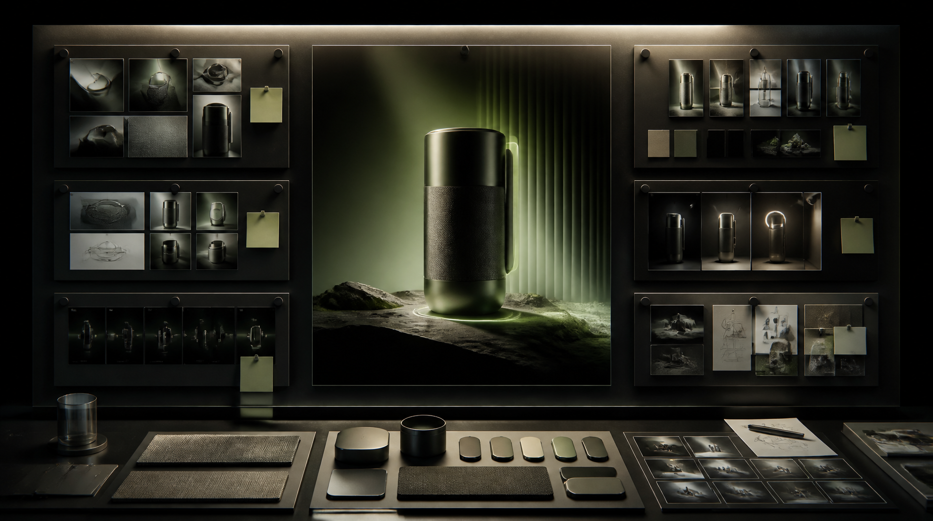
Most launch teams already build some version of a moodboard. They collect brushed metal, stone tops, soft paper texture, luxury shadows, careful hands, and editorial close-ups.
Useful. Still not enough.
Before prompting, build a seal-break truth sheet.
For an unboxing campaign, that sheet should answer:
what the authority packaging reference is,
which opening path is real: peel tab, tuck flap, magnetic lid, drawer pull, tear strip, ribbon lift, or shrink wrap removal,
where resistance is expected and where motion should stay smooth,
what must remain hidden before the first reveal beat,
which insert sits above which product surface,
whether tissue, foam, card, or tray material may crease, drag, or flex,
which hand role is allowed: stabilize, pull, lift, rotate, or present,
which frames can stay atmospheric and which ones are proof-sensitive,
and which close-ups still need real capture because they would be read as literal packaging evidence.
Example: for a premium serum launch in a black rigid box, the sheet is not only "soft-touch carton, silver foil, glass bottle." It is also:
tamper tab releases with one clean pull but not instantly,
lid opens with a short magnetic hesitation,
white tissue reveals only the cap silhouette on the first beat,
bottle lift happens after the tray edge clears the box wall,
and the PDP crop may show the closed box and the lifted bottle, but not a half-open transition that invents extra packaging layers.
That level of direction changes the conversation. The team stops saying "make it feel more luxury" and starts saying:
"The ribbon should tighten before the tray moves."
"The first reveal shows the cap shoulder, not the full front label."
"The insert card can bend slightly at the corner but cannot float."
"The paid-social opener can exaggerate pace, but it cannot change the opening order."
That is usable launch direction.
Run three proof scenes before the campaign gallery
Do not begin with a full folder of reveal ideas. Start with three proof scenes that force the packaging system to survive.
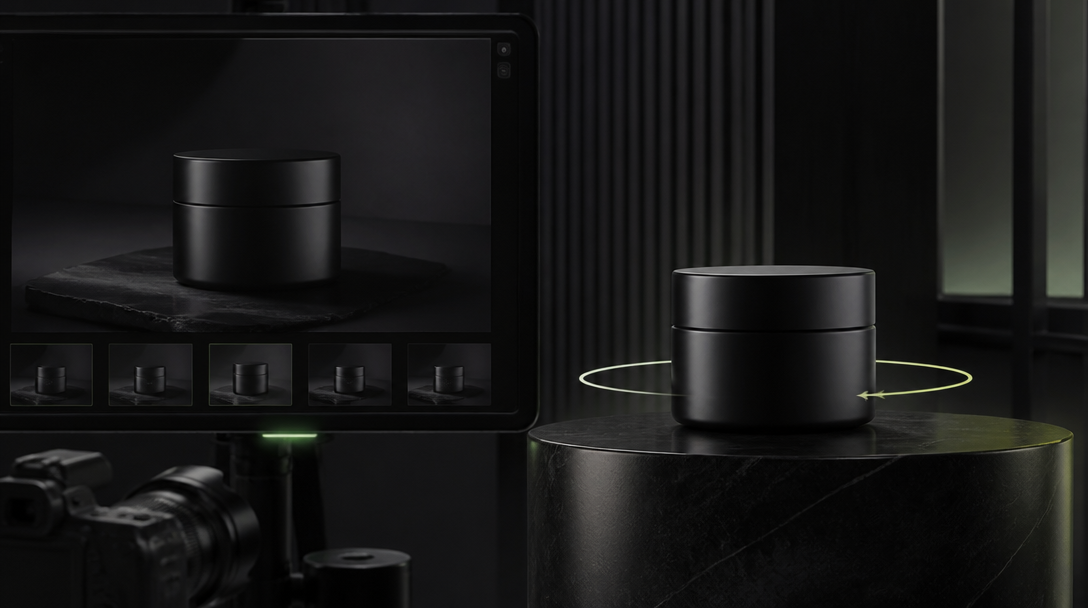
Test 1. The closed-pack authority frame
One frame. Box still closed. No reveal yet.
The question is whether the packaging already feels real enough to deserve motion:
board thickness,
edge discipline,
seal placement,
ribbon geometry,
material finish,
and hand scale if a hand is present.
Test 2. The first-break action
Choose one opening act only:
peel,
pull,
lift,
or slide.
Do not combine all of them into one flourish. If the opening cannot survive one believable action, more choreography will only hide the weakness for a moment.
Test 3. The product-lift continuity frame
Take the system into the surface that actually sells:
a paid-social opener,
a landing-page hero,
a PDP support frame,
or a launch email crop.
This is where many unboxing systems collapse. The reveal ad feels ceremonial. The destination frame feels generic. The pack shown in motion and the pack shown near conversion no longer seem to belong to the same product family.
Gateway Studio becomes useful here because it should remember:
approved opening order,
rejected hand interactions with reasons,
allowed hidden-before-open states,
paid-safe crops that still respect the packaging path,
proof-sensitive close-ups that need reality,
and the point where a reveal cut stopped being launch theater and started becoming usable product evidence.
Without that memory, every new edit re-argues the box from zero.
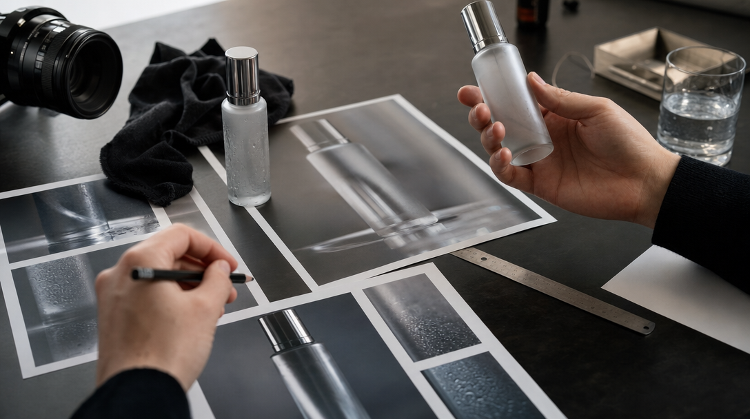
Know when to leave the model and capture for real
Some unboxing shots still belong in hybrid or real capture.
Switch sooner when the campaign depends on:
exact tamper evidence,
close-up finger contact on a seal, foil edge, or shrink wrap,
readable inserts or regulated package copy,
foil embossing that has to track light correctly,
die-cut foam or tray fit that buyers will inspect closely,
product-and-box scale that affects perceived value,
or a hero reveal where the sound and resistance are part of the promise.
That does not mean AI is weak. It means the workflow is adult.
The premium move is not to force every reveal through the same generation lane. The premium move is to decide which frames can stay atmospheric, which ones can be hybrid, and which ones are now carrying physical proof.
For unboxing ads, that decision usually arrives before the product clears the box.
The useful takeaway
If an unboxing ad feels fake, the problem is usually not that the image lacked polish. It is that the packaging behavior was never defined tightly enough.
Seal-break truth is not a tiny detail. It is the difference between a reveal that feels like premium launch choreography and a reveal that feels like packaging fan fiction.
Lock the opening path. Lock the resistance. Lock the insert order. Lock the hand role. Then let the image become dramatic.
That is how an AI reveal keeps its authority after the first beautiful frame.
It is the control document behind the reveal: how the pack really opens, where resistance should appear, what stays hidden before the first beat, how inserts stack, what the hand is allowed to do, and which close-ups still need reality.
Next move