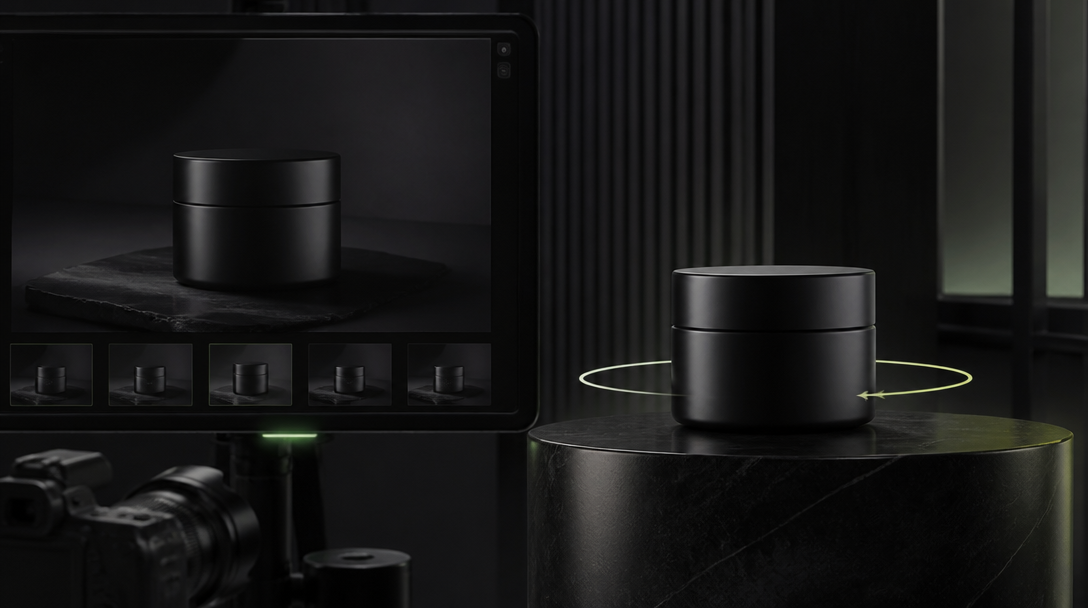
The bottle looked premium until it moved.
In the still, the frosted serum glass felt heavy, the chrome collar felt clean, and the label sat exactly where the brand team wanted it. Then the first motion test arrived. The collar stretched wider on the turn, the glass wall suddenly looked thinner, and the condensation started behaving like clear beads glued onto plastic.
Nothing was technically broken. The shot was still attractive. It just stopped feeling trustworthy the second the camera asked the object to behave like a real object.
That is the moment many teams blame the model. Usually the model is only exposing a truth the team never locked in the first place.
Before product motion, you do not just need a strong reference frame. You need a material truth sheet: one compact control layer that tells the workflow what the product is physically allowed to be when the light changes, the angle shifts, and a human hand enters the frame.
For Gateway, this is not prompt decoration. It is production insurance.
Motion exposes lies that a still image can hide
A single hero frame can hide a surprising amount of drift.
A fragrance bottle can look elegant from the front even if the shoulder geometry is slightly off. A canned drink can look cold in a static shot even if the droplet pattern does not behave like condensation. A matte supplement pouch can look expensive in one crop even if the zipper edge, gusset thickness, and foil stiffness all change when the pack bends.
The problem is not that stills are useless. The problem is that motion asks harder questions:
Does the glass keep the same thickness as it turns?
Does the metal stay satin, or does it suddenly flip into mirror chrome?
Does the label stay seated on the object, or does it start floating like a skin?
Do highlights travel across the product the way the real material would allow?
Does the product still look believable when a hand grips it, tilts it, or sets it down?
Take a premium beverage launch. The first frame shows a cold can on dark stone with a beautiful side highlight. Everyone likes it. The second pass adds a slow quarter-turn for paid social. Now the tab shape changes, the vertical print feels softer, and the droplets stay evenly decorative instead of reacting to the can's curvature. That motion did not ruin a good shot. It revealed that the shot never had a material rulebook behind it.
That is why product motion should start from physical truth, not from motion ambition.
A material truth sheet is not a moodboard with better manners
When teams hear "truth sheet," they often make something too loose. They gather a few references, write "premium, tactile, cinematic," and hope the model keeps the right feeling through motion.
That is not enough.
A usable material truth sheet should answer six blunt questions before animation starts:
Which frame or photo is the authority object?
Which materials are non-negotiable and how should each one read?
Which geometry details are allowed to move, and which must stay exact?
How should light behave on the surface?
What kind of handling is believable for this product?
What failure patterns are already banned?
For a skincare pump bottle, that might mean:
the authority object is the front-facing packshot approved by brand,
the bottle body stays dense frosted glass, not translucent plastic,
the chrome ring stays cool satin with narrow highlights, never mirror glare,
the pump neck cannot lengthen during a tilt,
fingerprints are allowed on the cap but not on the label face,
and heavy splash behavior is banned because the product is sold through restraint, not chaos.
For a coffee pouch, the truth sheet might say something totally different:
the pouch should crease like filled foil laminate, not soft fabric,
the zipper line must stay straight under light pressure,
the valve must stay visible from the approved side,
and the bag should settle with weight at the base instead of hovering like an empty mockup.
That level of specificity feels stricter than a normal creative brief. That is exactly the point.
What has to be locked before the first animation pass
The easiest mistake is locking style and leaving behavior open.
Product motion fails less from bad styling than from unanswered behavior.
1. The primary material has to win every angle
Choose the material cue the buyer will trust first.
For a fragrance bottle, it may be glass thickness. For a stainless bottle, it may be brushed metal grain. For a cosmetic compact, it may be the snap-fit edge and lacquer finish.
If that primary cue mutates across a turn, the whole object starts reading like a concept sketch.
One strong test: If you pause the motion on frame 3, frame 11, and frame 19, does the object still belong to the same physical product?
If the answer changes with the angle, the material truth is not locked yet.
2. Edge behavior matters more than center beauty
Teams often review the face of the object and ignore the edges. The edge is usually where fake motion announces itself first.
Think about a serum bottle with a metallic collar. The front label may stay acceptable while the collar edge widens, the shoulder curve softens, and the glass-to-metal join starts breathing from frame to frame.
That is why the truth sheet should mark edge-critical zones:
cap seam,
label edge,
shoulder transition,
base thickness,
zipper line,
foil crimp,
nozzle silhouette.
If those zones drift, the viewer may not name the flaw, but they will feel it.
3. Liquids, droplets, and texture need rules, not vibes
This is where a lot of premium product motion becomes accidental fantasy.
A beverage ad wants moving condensation. A beauty film wants moisture on glass. A food shot wants surface gloss.
Without rules, every one of those details turns decorative and fake.
For a chilled canned drink, the sheet should decide:
are droplets sparse or dense,
should they streak under movement or stay held,
where is the can coldest,
how large can beads become before the can starts looking lacquered,
and whether the motion is allowed to show run-off at all.
For a lip oil bottle, the question is different: the oil inside may catch light, but it should not slosh like water unless the real product would.
In other words, the team should not say "make it juicy." It should say what the liquid is allowed to do.
4. The label and print area need a hard boundary
Readable text is usually removed or softened in generated visuals, but print behavior still matters.
Even when the label copy is not legible, the object needs believable print placement, wrap tension, spacing, and edge discipline.
A supplement label that creeps a millimeter higher on every turn reads fake. A perfume mark that keeps changing its vertical center reads fake. A canned drink with decorative print that ignores the cylinder's wrap reads fake.
The sheet should specify:
front-face alignment,
safe distortion limits on curved surfaces,
whether the print sits flush or slightly inset,
and whether the animation may ever show a label edge lift, wrinkle, or glare band.
That sounds obsessive. It is cheaper than throwing away a whole motion family later.
5. Handling has to match the product class
A hand can save product motion by adding scale and believability. It can also destroy it instantly.
If a heavy glass jar is picked up like an empty prop, the illusion breaks. If a resealable pouch collapses like soft cloth when it should hold fill weight, trust drops. If a premium electronics object is rotated with vague fingertip contact, the whole scene feels rehearsed instead of real.
That is why the truth sheet should call out believable handling:
grip points,
pressure level,
whether one-hand use is realistic,
how much the object can tilt,
and what contact marks are acceptable.
For a dropper bottle, a slightly awkward cap re-seat can feel more truthful than a sterile perfect close. For a luxury carton, too much thumb pressure on the side wall can make the product feel flimsy.
The hand is not just a styling choice. It is a physics test.
6. Motion ceiling has to be defined before anyone asks for "more drama"
Some products can carry aggressive camera movement. Many cannot.
A reflective compact with gold trim may only survive a slow arc and short parallax move. A watch face may need tighter macro control and almost no reckless push-in. A soft-touch pouch may tolerate a handoff and a gentle table drop, but not a spinning hero reveal.
If the team does not define the motion ceiling, the request for excitement will usually outrun the product's ability to stay believable.
The better question is not "How dynamic can this look?" It is "What is the fastest move this object can survive without losing truth?"
What to test first before you scale the motion system
Do not build six ad variants before these four tests clear.
The quarter-turn test
Take the approved hero object and run the smallest useful turn.
Not a full theatrical spin. Just enough motion to expose edge changes, highlight travel, and label behavior.
If the bottle shoulder changes character during a ten-degree move, more variants will only multiply the same lie.
The grip test
Bring in one believable hand interaction.
For a skincare bottle, that might be a pickup from a vanity tray. For a canned drink, it might be a chilled lift with slight moisture transfer. For a supplement pouch, it might be a squeeze at the top third to show fill weight without deforming the closure.
This test answers whether the object belongs in the real world or only in a still-life fantasy.
The shadow and reflection test
Move the light or the object enough to see whether the surface keeps its logic.
Chrome should not behave like polished mercury one frame and brushed steel the next. Frosted glass should diffuse highlights consistently. Soft-touch laminate should not suddenly bounce sharp specular streaks.
When product motion feels fake, reflections are often the first witness.
The ad-to-PDP continuity test
This is the business test.
Put the motion asset next to the PDP hero, the packshot, or the launch still the buyer will actually see after the click. If the ad object looks richer, colder, wetter, thinner, or more luxurious than the product truth on the page, the motion is stealing trust from the conversion path.
Gateway cares about this because a beautiful ad that weakens the landing page is not a premium outcome. It is expensive drift.
What Gateway Studio should own before the next render
This is exactly the kind of workflow that should live in Gateway Studio instead of scattered across folders and chat threads.
The workspace should hold:
the authority still or packshot,
the material truth sheet,
the edge-critical zones,
the banned drift list,
the approved motion ceiling,
the handling notes,
the rejected clips with reasons,
the ad-to-PDP continuity note,
and the model-routing note for which passes are allowed to explore and which are only allowed to refine.
That last point matters.
The first fast pass can be exploratory. The hero refinement pass cannot be. If a team uses the same loose settings for both, it keeps inviting fresh drift exactly when it should be locking truth.
In practice, Gateway Studio should be the place where the team can open one product launch and immediately see:
which frame is the parent truth,
which material cues are sacred,
which motion tests already failed,
and which output is safe to cut into paid, PDP, and launch surfaces.
That memory is worth more than another prompt rewrite.
Before you animate, ask the rude physical question
Here is the blunt test before the next motion prompt:
If the camera turns, the light shifts, and a hand touches the object, what exactly is not allowed to change?
If the team cannot answer that in plain language, it is not ready to animate the product yet.
That does not mean the concept is bad. It means the workflow is still trying to sell motion before it has locked truth.
The premium move is slower for one hour and faster for the next three weeks: write the material truth sheet, test the object under small pressure, store the failures, then animate with rules.
That is how product motion stops looking like a beautiful guess and starts behaving like a believable commercial asset.
It is the compact control layer that defines the authority frame, non-negotiable materials, edge-critical zones, light behavior, believable handling, motion ceiling, and banned failure patterns before animation starts.
Next move