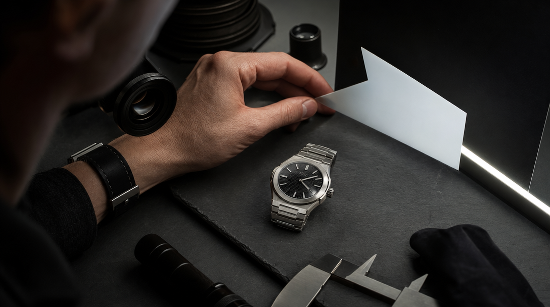
The hero frame worked.
Brushed steel case. Deep black dial. One hard strip of light skating across the crystal.
Everyone relaxed because the watch finally looked expensive.
Then somebody zoomed in.
The minute markers changed thickness near 4 o'clock. The crown sat too close to the case, like it belonged to a different reference. The bracelet bent in one place and froze in the next. The polished chamfer caught a room reflection that the bezel never saw.
Nobody outside the review call will say the geometry drifted. They will say something simpler: the watch feels fake.
That is the problem with AI-led watch advertising. The category can survive a moody hero shot for a second, but trust is usually won or lost in macro. Luxury watch buyers read machining, mass, alignment, and restraint through light. If those signals wobble, the asset stops feeling premium even when the styling, casting, and color grade are excellent.
Gateway's view is simple: in watch work, macro is not decoration. It is the proof surface. Before a brand scales AI watch ads, launch stills, or short motion loops, it needs a macro proof board: case geometry, crown logic, dial legibility, bracelet articulation, wrist contact, reflection discipline, and the exact close-ups that still need reality.
Watch buyers audit engineering through light
A lot of product categories can hide inside atmosphere longer than watches can.
Fragrance can survive some abstraction. Fashion can sometimes borrow trust from styling before motion exposes the fabric. Furniture can get one generous angle before room scale betrays it.
Watches are less forgiving.
A premium watch is bought through detail. The viewer is reading whether the case thickness makes sense, whether the lugs meet the strap naturally, whether the bezel teeth feel cut instead of melted, whether the second hand belongs to the same dial, and whether the crystal is reflecting one believable room.
Take three common examples:
A diver-style launch visual uses a dramatic wet-black background and strong side light. The first frame looks luxurious. Then the macro shows a bezel pip that drifts off center and a crown guard that changes shape between crops.
A dress-watch campaign leans on a clean champagne dial, leather strap, and a sharp sleeve. The mood is right, but the crystal glare wipes out the indices exactly where the paid crop needs proof of dial discipline.
An integrated-bracelet sports watch looks powerful in a three-quarter hero. Then a wrist scene reveals links that articulate like sheet metal instead of weight-bearing metal components.
Those are not collector-only complaints. They are commercial trust complaints.
People do not need to know watchmaking terms to feel when the object stopped behaving like one coherent piece of engineering.
The four lies teams approve too early
Most weak AI watch visuals are not rejected because they look obviously bad. They get approved because they look expensive from far away.
The trouble starts in four predictable places.
1. The crown and case stop belonging to the same watch
The crown is one of the fastest truth tests in the whole category.
If the crown stem is implied from the wrong angle, if the guard geometry softens, or if the crown size changes when the shot moves from hero to detail crop, the watch starts feeling invented.
Think about a GMT-style sports watch. The room may be admiring the blue-black bezel split and the bracelet shine. Meanwhile the crown knurling turns vague, the guards pinch in too tightly, and the case profile becomes thinner than the same watch could physically support.
That is enough to break the sale for anyone who reads watches as objects, not props.
2. The bracelet looks plated onto the watch
Bracelets fail differently from straps.
A leather strap can survive some softness if the scene is atmospheric and the stitching is not the proof moment. An integrated bracelet cannot.
The viewer reads:
link rhythm,
taper,
spacing,
weight at the wrist,
and whether the articulation still makes sense under gravity.
This is where many AI watch assets go decorative. The head of the watch may look convincing, but the bracelet behaves like jewelry costume armor with no real hinge logic.
For a launch ad, that is not a minor issue. The bracelet is part of the product promise.
3. The crystal is reflecting a different room than the metal
Watch reflections are subtle, which is why teams miss them.
The dial can feel deep. The polished bezel can feel crisp. The sapphire crystal can look premium.
And still the image fails because each surface appears to be living in a different lighting setup.
Maybe the crystal shows a broad soft window, the bezel shows a narrow strip source, and the case flank suddenly picks up a warm reflection that no other surface acknowledges.
That kind of mismatch does not read like "lighting complexity." It reads like compositing drift.
This is close to the problem in AI Car Ads Reflection Continuity Before the Tracking Shot, but watch work is even less forgiving because the object is smaller and the proof lives right on the surface.
4. The dial wins the hero and loses the selling crop
Some watch images look brilliant only in the original composition.
Then the asset gets cropped for 4:5, 9:16, PDP support, or a paid detail cut and the truth disappears.
The applied indices are no longer readable. The date window gets soft. The minute track bends. The subdial spacing feels wrong. The lume plot shape mutates near the edge of the frame.
That is why watch review cannot stop at the hero image. The crop that actually sells is often stricter than the one that earned applause in the room.
Separate aura shots from proof shots before the review starts
Watch brands get into trouble when one image is expected to do every job.
It cannot.
Aura shots
These build desire. They can sell restraint, mood, status, and taste.
Examples:
a black-dial chronograph sitting in low evening light beside a leather folio,
a steel sports watch half under a shirt cuff at a dinner table,
or a gold dress watch held inside a quiet editorial portrait frame.
These images matter. They tell the viewer what kind of object this is allowed to feel like.
But aura is not the same as proof.
Proof shots
These defend the product.
Now the watch must survive:
case profile,
crown alignment,
dial legibility,
bracelet or strap attachment,
clasp logic,
and one believable light family.
Example: if a paid launch asset needs to justify the jump from a fashion watch to a real luxury price point, the proof shot cannot hide behind shadow and styling. It needs cleaner evidence that the watch is built, not merely staged.
Hybrid campaigns
This is usually the smartest route.
Use AI to define the campaign world, the editorial opening, the paid-system mood, and the secondary crops. Use hybrid or real capture for the proof-heavy macros where the object has to defend itself literally.
A brand may keep the AI hero still, the moody wrist scene, and the campaign layout visuals. It may still switch to real capture for:
crown-and-case macro,
clasp closure,
dial-at-angle proof,
or the wrist-contact shot that answers thickness and comfort questions.
That is not a retreat. It is production discipline.
Build a macro proof board before you prompt
Moodboards are not enough for watches.
The more useful control object is a macro proof board. Think of it as the product-truth sheet for the category.
It should lock:
the exact watch reference or family being represented,
case diameter and apparent thickness range,
crown shape, guard logic, and approved angles,
dial layout priorities: indices, hands, date, subdials, minute track,
metal behavior: brushed, polished, blasted, gold, titanium, ceramic,
approved reflection lane: strip light, window light, soft top light, mixed environment,
bracelet or strap attachment rules,
clasp or buckle truth,
what the wrist scene must prove,
which details may stay atmospheric,
and which macro frames still require reality.
Example: for an integrated-bracelet steel sports watch, the board should not just say "premium steel, dark dial, dramatic reflections." It should say:
bracelet taper must stay visible through the first five links,
crystal can show one controlled strip reflection but must not erase the 12, 3, and 9 markers,
crown must sit proud enough to feel usable but not oversized,
the wrist scene must preserve case thickness and first-link drop,
and the paid detail crop cannot rely on motion blur to hide bezel or dial drift.
Once that board exists, the room starts making better decisions.
Instead of saying "make it more luxury," the team can say:
"The first link is flattening too early."
"The crown feels decorative, not engineered."
"The crystal reflection is selling atmosphere but killing dial truth."
"This crop still works for editorial, but not for conversion."
That is the level where watch work becomes useful.
Run three review frames before the full asset set
Do not start with a whole gallery. Start with three narrow proofs.
Test 1. The authority still
One controlled hero still.
The question is simple: does the watch belong to one believable design and one believable light setup?
You are checking:
case silhouette,
lug shape,
crown logic,
dial balance,
and the first reading of the metal.
Test 2. The wrist transition
Now put the watch on a wrist or wrist-like contact surface.
This is where the product stops being an isolated sculpture and becomes something a person could actually wear.
You are checking:
first-link drop,
strap tension,
thickness against skin,
sleeve contact if present,
and whether the watch still feels like the same object once human scale appears.
Test 3. The clasp or closure proof
One close shot of closure logic.
That might be:
deployant clasp,
folding clasp,
tang buckle,
rubber strap fit,
or bracelet closure at a realistic angle.
The reason is simple: closure detail is where premium watch work often stops being a fantasy and starts becoming a product.
If these three frames hold, the wider campaign has a real foundation. If they fail, more renders will only multiply prettier mistakes.
When real capture is still the cheaper decision
Some watch moments are too literal to fake economically.
Real capture is usually the smarter line when the campaign depends on:
collector-sensitive macro detail,
precious-metal finish that needs exact color behavior,
anti-reflective crystal proof,
clasp mechanics,
lume or engraved detail,
readable date or complication information,
or a wrist scene that has to answer wearability, not just style.
This is especially true when the audience is comparing the watch against other premium references and will zoom before they trust.
Sometimes the most expensive choice is not the shoot. It is the beautiful synthetic image that forces the team to defend the object afterward.
What Gateway Studio should remember after review
If a watch campaign is going to scale, someone has to preserve the truth layer.
Gateway Studio should keep:
the approved macro proof board,
the authority stills by watch family,
reflection lanes that stayed believable,
bracelet or strap rules by asset type,
crops that remained proof-safe,
banned drift examples with reasons,
hybrid handoff notes for real-capture macros,
and the exact review line where the asset stayed editorial versus became product proof.
That memory is what keeps the next launch from relearning the same lesson with a new prompt and a better grade.
The useful question is not whether AI can make a watch look expensive.
It can.
The useful question is whether the watch still survives the macro once money is about to move.
For premium brands, that is where the campaign actually begins.
Because the hero frame can borrow trust from styling and mood, but the macro reveals whether the watch still behaves like one coherent object: crown, dial, crystal, bracelet, and case geometry all have to agree.
Next move