The packshot was not the problem.
The can had already passed the easy part of the review. Color looked right. The side highlight felt expensive. The brand world was clean.
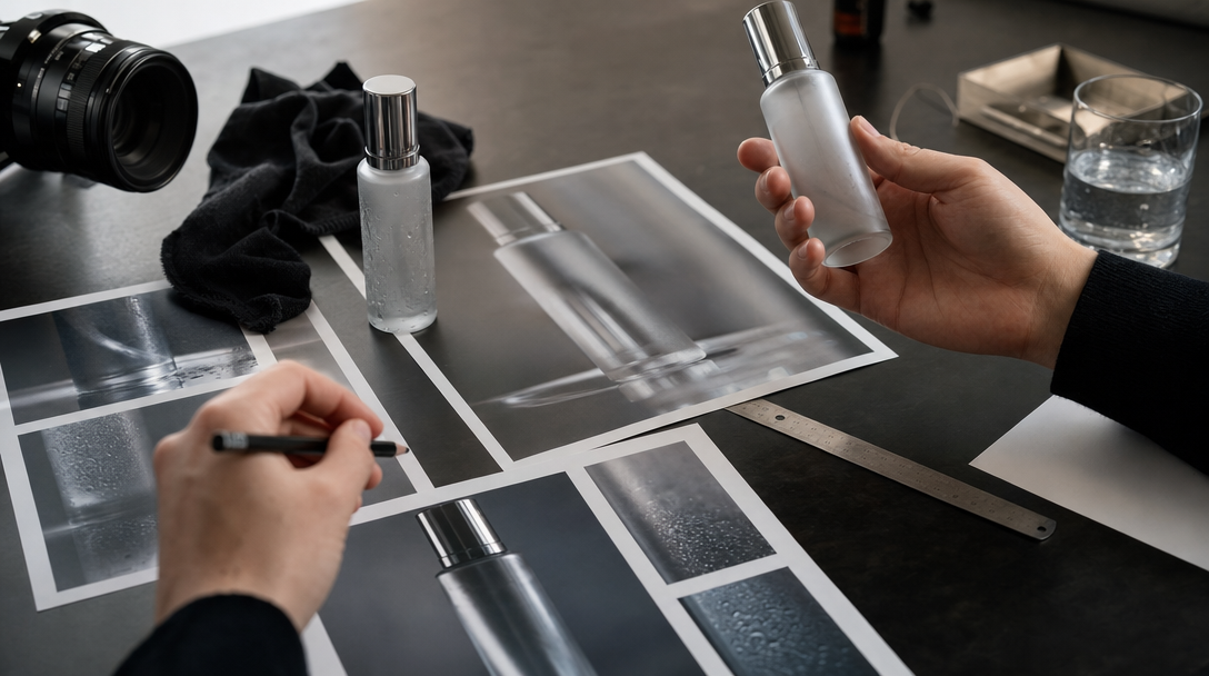
Then someone slowed down the pour test.
The droplets sat on the can like decoration instead of cold moisture. The fill line climbed between shots. The foam looked styled instead of carbonated. What felt premium at first suddenly felt like a drink nobody could actually open, pour, or taste.
That is the trap in beverage work. Teams often talk about coldness as if it were atmosphere. It is not. In a beverage ad, coldness behaves like evidence. The moment the viewer starts reading temperature, fizz, dilution, or serving ritual as product truth, the frame is carrying commercial weight.
Gateway's view is simple: AI beverage ads can be excellent, but only if the team locks condensation truth before it asks the model for drama. That means pack geometry, fill line, droplet behavior, foam ceiling, glass logic, and hand role all need rules before the first pour becomes the hero.
Coldness carries meaning in beverage ads
A beauty frame can sometimes stay atmospheric longer. A SaaS frame can stay concept-led longer. A beverage frame gets inspected faster.
People immediately read:
whether the can or bottle feels physically cold,
whether the pour suggests a believable texture,
whether the glassware matches the product position,
whether the bubbles or foam imply a real drinking experience,
and whether the brand is showing mood or quietly pretending to show proof.
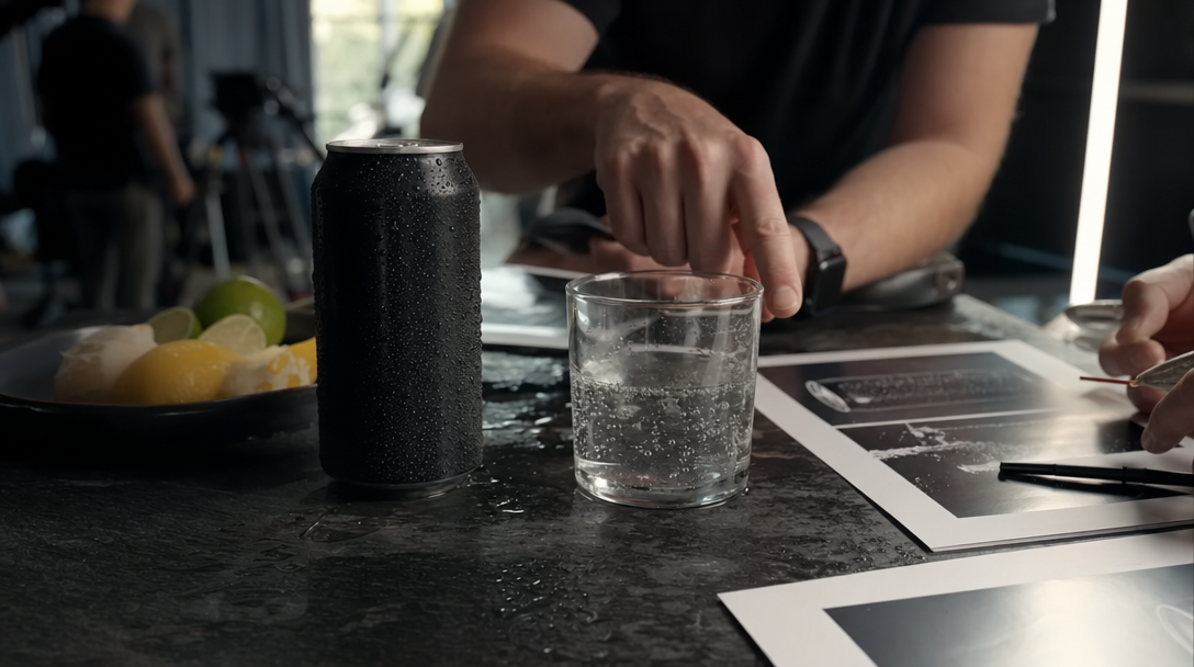
Take a premium sparkling water launch. One static hero can look perfect on dark stone with sliced citrus, hard side light, and a wet surface. The problem starts when the campaign expands into short paid cuts and landing-page close-ups. If the droplets stay evenly decorative, the pull tab changes shape, or the bubbles in the glass read like random glitter, the shot stops feeling like cold product truth and starts feeling like poster styling.
Or take a canned oat latte. The first frame may sell the brand tone beautifully. Then the second frame adds a pour. If the stream thickness changes mid-shot, the crema behaves like whipped topping, or the ice suddenly floats in impossible positions, the ad is no longer just cinematic. It is commercially confusing.
That is the first rule: in beverage work, "cold" is not a mood word. It is a product behavior word.
The failures teams approve too early
Most beverage reviews do not fail on the obvious weird frame. They fail on the attractive frame that nobody interrogated hard enough.
Here are the four mistakes that show up first.
1. Decorative condensation
Real condensation is uneven. It reacts to curvature, temperature difference, handling, and time.
Fake condensation usually gives you:
identical droplets across the whole pack,
beads that ignore the metal seam or label edge,
moisture that looks glued on instead of forming and moving,
or a can that is "wet" without feeling cold.
In a flavored seltzer ad, those droplets may look premium in a still. In motion, they instantly reveal whether the scene understands the object or only the look of a cold object.
2. Fill line drift
Teams often watch the front label and miss the liquid.
That is a mistake. If the liquid level changes between the hero pack shot, the glass shot, and the pour crop, the ad starts telling three different product stories at once.
The same problem appears in canned coffee and ready-to-drink cocktails. The brand may want richness and appetite. The viewer may instead notice that the beverage suddenly became denser, darker, or foamier from one shot to the next.
3. Pack geometry that collapses under motion
A beverage container can look fine from the front and still break the moment it turns.
Watch:
tab shape,
rim thickness,
neck profile,
label wrap,
seam placement,
shrink sleeve fit,
and cap seating.
One quarter-turn is often enough to expose whether the workflow is protecting a real pack or inventing a prettier cousin.
4. Serving ritual that promises too much
The hand matters. The glass matters. The garnish matters. The moment of opening matters.
If a premium tonic is always shown in a heavy rocks glass with a perfect citrus twist, the viewer reads craft and occasion. If the same product then lands on the PDP in a plain can crop with no continuity, the brand has borrowed more atmosphere than the product page can return.
The problem is not beauty. The problem is mismatch.
Build a condensation truth board before you prompt
Most teams know how to build a moodboard for drinks. They bring chrome bar references, wet tabletops, directional highlights, citrus slices, cracked ice, and expensive nightlife color.
Useful. Still not enough.
Before generation starts, build a condensation truth board.
For a beverage launch, that board should answer:
what the authority pack reference is,
whether the pack is cold from the fridge, cold from ice, or simply fresh and ambient,
which condensation state is allowed: dry pack, light mist, forming beads, heavy droplets, or run lines,
what the liquid level is allowed to be in can, bottle, and poured glass,
how foam, crema, fizz, or bubbles behave at their believable maximum,
which glass shapes are approved,
what kind of ice is allowed and how clear it should be,
whether a hand may grip the pack, the glass, or both,
which shots may stay atmospheric and which are proof-sensitive,
and which retail or legal surfaces still need stricter capture.
Example: for a premium yuzu sparkling water, the authority is not only the front can render. It is the real can geometry, the approved chill state, the exact fill line in the serving glass, the level of citrus styling the brand can defend, and the rule for whether the hero scene is selling refreshment or implying taste proof.
That board changes the conversation. The team stops saying "make it colder" and starts saying:
"The can may carry light beads, not heavy run lines."
"The glass can show active carbonation, but not champagne-like foam."
"The product page crop cannot use the garnish-heavy hero from paid social."
"The black cold-brew can stays matte even under a brighter rim light."
That is usable direction.
Run three narrow tests before the campaign gallery
Do not start with twenty frames. Start with three tests that force truth to survive.
Test 1. The cold pack hold
One static hero or near-static motion. No pour yet. No garnish drama.
The question is whether the pack can stay physically believable under close inspection:
shape,
droplets,
seam,
label,
and temperature read.
Test 2. The serving moment
Choose one action only:
crack open,
short pour,
bottle tilt,
or glass set-down.
Do not combine all of them. The goal is to see whether the product survives one believable act without turning theatrical.
Test 3. The continuity crop
Take the same visual system into the destination surface:
landing page hero,
paid social opener,
PDP support image,
or launch email crop.
This is where many beverage systems fail. The ad world looks lush and chilled. The destination crop looks flatter, warmer, and like a different product family.
Gateway Studio becomes useful here because it should remember:
approved condensation states by surface,
rejected droplet patterns with reasons,
glassware rules,
garnish ceiling,
fill-line notes,
safe paid-social crops,
and continuity rules between ad, landing page, and retail proof.
Without that memory, the team keeps re-solving coldness from scratch.
Know when to leave the model and capture for real
Some beverage scenes are still better handled with hybrid or real capture.
Switch sooner when the shot depends on:
readable pack text in a macro frame,
exact legal or nutrition truth,
difficult transparent liquid behavior,
foam or crema that must look category-accurate,
ice contact and melt detail,
extreme close-ups of carbonation,
or retailer surfaces that will be judged like evidence instead of mood.
That does not make AI weak. It makes the workflow adult.
The premium move is not to force every drink scene through the same generation lane. The premium move is to decide which scenes may stay stylized, which scenes can be hybrid, and which scenes need reality because the brand is asking the viewer to believe too much too closely.
For beverage ads, that decision usually arrives before the first pour, not after the team has already fallen in love with the wrong frame.
It is the control layer behind the image: authority pack reference, approved chill state, allowed droplet behavior, fill-line rules, foam or carbonation ceiling, glassware logic, hand-role rules, and the split between atmospheric shots and proof-sensitive shots.
Next move