A furniture frame can look expensive in the middle and still fall apart before the viewer reaches the edge of the image.
The sofa reads premium. The stone floor feels calm. The color palette lands. Then the side table suddenly looks child-sized, the window sill sits too high for the seat, and the lamp shadow suggests a second sun that does not belong to the room.
That is where trust leaves.
In furniture work, the room is not background styling. The room is part of the product proof.
Furniture buyers read the room to judge the object
People do not evaluate a chair the way they evaluate a beauty still or a floating packshot. They read the object against the architecture around it.
The fastest cues are usually mundane:
baseboard height,
outlet placement,
rug border width,
coffee-table distance,
armrest height relative to the window line,
the way a hand reaches the seat,
whether the lamp, side table, and sofa feel like they belong to the same scale.
Take a premium boucle sofa ad. The texture may look convincing. The stitching may even survive. But if the seat depth feels too shallow for the throw pillow, or the coffee table sits too low for the whole scene, the viewer stops trusting the furniture before they consciously name the issue.
That is why room-scale drift is a commercial problem, not an art-direction footnote.
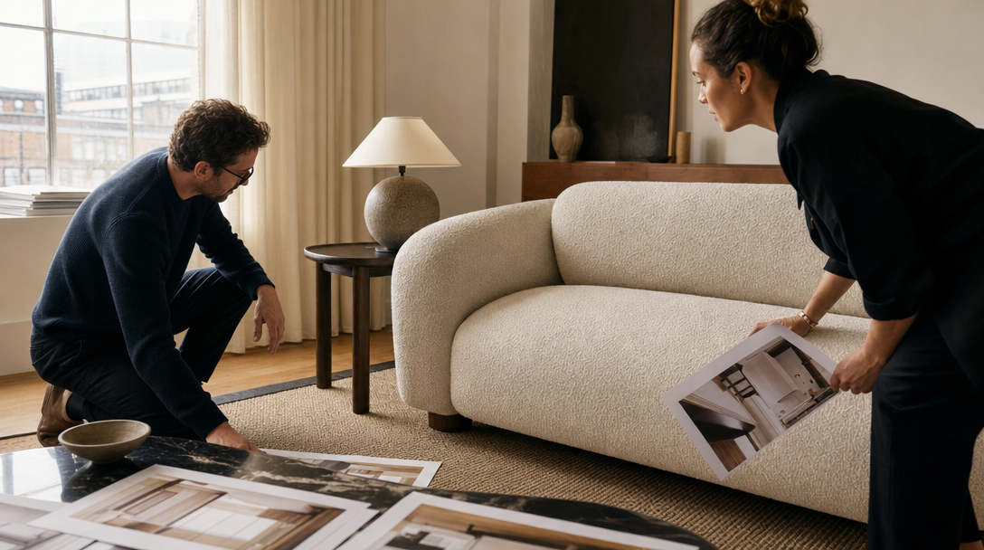
Start with a room-scale sheet, not another moodboard
Most teams already know how to build a taste board.
What they skip is the operating sheet that tells the model how the room is allowed to behave.
For furniture ads, the control layer should start with a room-scale sheet:
target seat height band,
plausible camera height range,
focal-length lane for each shot family,
floor-to-window and floor-to-table relationships,
clearance zones around the product,
approved styling density,
one human contact point the scene can survive.
Example: if the hero product is a walnut dining chair, define whether the approved family is eye-level editorial, slightly lowered dining perspective, or standing-room lifestyle perspective. Do not let the same campaign bounce from a low cinema lens to a ceiling-height real-estate angle and pretend those belong to one truth surface.
That sheet is boring in the best way. It keeps the room from improvising against the product.
The first test shot should be a proof shot, not the prettiest shot
Teams often start with the most atmospheric frame: wide room, perfect sunset, draped throw, polished floor, maybe one elegant silhouette crossing the back.
That shot is useful for mood.
It is a weak first test.
The better first test is a three-quarter room scene that includes one human interaction with the furniture. A person setting down a mug near the armrest. A hand straightening a dining chair before sitting. Someone brushing past the edge of a bed bench.
Why that shot?
Because it exposes the real failure points fast:
seat height against the hand and wrist,
cushion compression,
table distance,
walkable clearance,
lamp and side-table proportion,
whether the room still feels like it was built for the object instead of around a hallucinated prop.
If that shot does not hold, a wider hero frame only hides the problem. It does not solve it.
Separate atmosphere shots from dimension-proof shots early
Furniture brands usually need both.
One family sells taste. Another family carries evidence.
An atmosphere shot can go wider, cleaner, and more cinematic. It can sell the room world, the emotional temperature, the color discipline, the quiet of the morning light.
A dimension-proof shot has a different job. It needs the buyer to believe:
how tall the headboard feels,
how deep the sofa really sits,
whether the table can hold a real dining setup,
how a reading chair occupies the corner,
whether the object still feels usable once another real object enters frame.
For example, a premium sectional may look excellent alone in a wide editorial living room. The retargeting cut, though, may need a narrower scene with one person sitting in the corner seat, one book on the chaise, and one side table placed at believable reach distance. The second shot is less glamorous. It is often the one that closes the doubt.
That is also the split Gateway Studio should own. One lane protects atmosphere. The other protects scale truth.
What breaks most often in AI furniture ads
The pattern is usually not “bad taste.” It is unstable physical logic.
The common failures are:
the camera height changes so much that the furniture feels smaller or larger every time it reappears,
the room edges introduce impossible architecture,
a rug, lamp, or table silently resets the scale,
daylight direction flips between shots,
a bed, sofa, or chair behaves like a stage object with no believable weight,
styling props make the room prettier while making the product less trustworthy.
One classic example is a lounge chair ad where the chair itself looks refined, but the side table reads as if it belongs to a hotel room miniature. Another is a dining table render where six chairs fit too comfortably because circulation space was invented rather than observed. A third is a bedroom shot where the bench at the foot of the bed looks elegant until you realize no adult could actually pass between it and the wall.
These are not tiny errors. They change whether the viewer believes the product would fit in real life.
What Gateway Studio should remember after review
Furniture work gets stronger when the team stops reviewing every new render like a stranger.
Gateway Studio should keep:
the room-scale sheet for each product family,
approved lens-height lanes,
the object pairings that preserved trust,
the props that made the scale worse,
rejected frames with notes about why the room lied,
which shots were safe for mood and which shots had to carry proof,
the point where hybrid or real capture became the smarter move.
Imagine a furniture launch with a sofa, lounge chair, and side table set. The first AI round may already find the campaign light, palette, and styling direction. The second round should not restart from taste alone. It should inherit the approved seat-height feeling, table reach, rug proportion, and the exact corner compositions that felt believable.
That is the difference between generating pretty interiors and building a furniture ad system that can survive paid, landing-page, and launch scrutiny.
Closing thought
Furniture AI does not usually fail because the center of the frame is ugly.
It fails because the room starts lying before the product gets a fair chance to sell.
When the scale holds at the edges, the object feels calmer, more expensive, and more credible. When it does not, even a beautiful render starts sounding like fiction.
That is why the room belongs in the approval stack.
Not after the furniture.
With it.
It is the control layer behind the render: target seat-height range, camera-height and lens rules, object clearances, styling density, and the room relationships that must stay believable around the furniture.
Next move