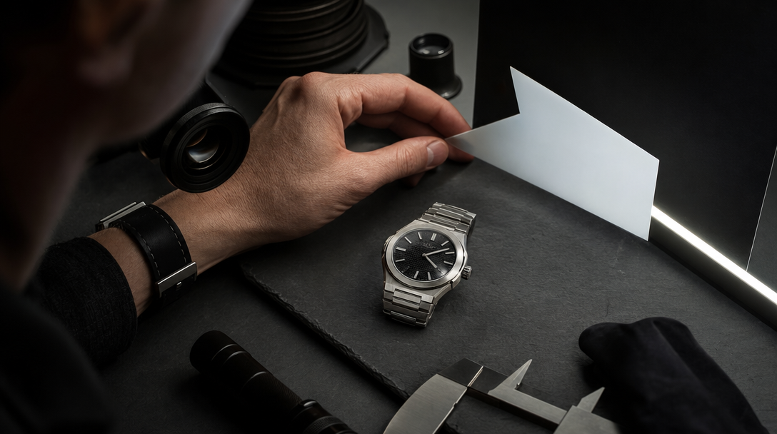
In the review room, the ring passed the first still and failed the turn.
Head-on, everything looked expensive: clean white fire in the center stone, a dark base, one disciplined highlight on the prongs. Then the piece rotated a few degrees. The diamond went flat, the side stones started reading like pasted glitter, and the yellow gold began carrying more attention than the thing the image was supposed to sell.
That is where most AI jewelry advertising quietly loses the room.
Teams often blame the prompt because it is the most visible input. The more useful diagnosis is harsher: the light logic was never locked. Jewelry does not forgive vague lighting the way a handbag, garment, or even a watch sometimes can for one flattering frame. The buyer is reading whether the stone returns light, whether the metal is shaping or stealing that light, whether the skin tone is warming the product the right way, and whether the close crop still feels like one physical object instead of a decorative illusion.
The useful lesson is this: jewelry ads do not become trustworthy when you ask for more sparkle. They become trustworthy when you build a stone-light map before generation.
A stone-light map is the control layer for what the light is allowed to do on the table, inside the stone, across the prongs, against skin, and inside the paid crop. Once that map exists, a team can decide what AI should own, what hybrid production should protect, and what still needs real capture before a premium launch goes live.
Jewelry is bought through light behavior, not only through shape
Almost every category likes good lighting.
Jewelry depends on it more brutally because the light is not just flattering the object. It is explaining the object.
A ring buyer reads:
whether the center stone has depth or just noise,
whether the metal supports the stone instead of shouting over it,
whether the prongs still make physical sense at macro distance,
whether the scale against skin feels believable,
and whether the same piece could survive e-commerce crops, social edits, and launch close-ups without changing identity.
Take three common campaign situations:
A solitaire engagement ring looks dramatic on black stone with one hard top light, but the table reflection goes dead as soon as the ring rotates and the diamond stops feeling alive.
A tennis bracelet looks premium in the hero still, then loses trust on wrist because the stones all emit the same generic sparkle and the articulation no longer follows the hand.
A gold necklace with colored stones wins the editorial frame, then fails the paid crop because the neck light warms the metal beautifully while muting the gemstone color the buyer was actually coming for.
Nobody says, "the pavilion is no longer returning believable light." They say: it looks fake.
That is the commercial problem.
Harder prompts often make jewelry worse
When a jewelry visual feels weak, many teams ask for more: more brilliance, more luxury, more sparkle, more glow, more drama.
That usually pushes the image in the wrong direction.
Jewelry failure is rarely caused by insufficient intensity alone. It is more often caused by uncontrolled competition between four surfaces:
the stone,
the metal,
the environment,
the skin or styling around the piece.
Here is what that looks like in practice.
The stone gets louder but less believable
A diamond ring can become visually busy long before it becomes persuasive.
Imagine a bridal hero frame built for an upper-funnel social launch. The AI output adds more white flashes, brighter facet noise, and stronger contrast because the team keeps asking for "more premium sparkle." The result wins attention for half a second. Then the stone starts behaving like an LED effect, not a cut object with depth, extinction, and controlled return.
The viewer may not know gemology. They still know when the stone is shouting instead of breathing.
The metal starts carrying the scene
Gold, platinum, and silver are helpful because they frame the product. They become dangerous when they begin outperforming the stone.
Take a yellow-gold ring on warm skin in late-afternoon light. The art direction wants intimacy and richness, so the whole frame leans warmer. Suddenly the metal looks delicious, the skin looks expensive, and the diamond starts looking secondary. The image is still beautiful. It is just no longer selling the right thing.
That problem is common in earrings and necklaces too. A polished surface catches a glamorous reflection and the gemstone, pearl, or diamond center quietly dies underneath it.
The body context breaks scale
Jewelry needs human context because scale matters. Human context also creates instant risk.
A bracelet that looks elegant on a dark tray can fail the moment it hits a wrist if the stone size no longer matches the hand, the clasp orientation stops making sense, or the line of the bracelet floats above the skin like a rigid graphic.
The same happens with earrings. One portrait crop feels refined. Then the lobe contact, hair shadow, and neck angle make the piece feel lighter, larger, or more ornamental than it should.
The paid crop asks a different question than the editorial crop
This is where launch teams get punished.
The editorial hero can live on mood for longer. The paid crop cannot.
The 4:5 or 9:16 cut often moves closer to the exact area where jewelry has to prove itself: stone return, prong logic, pavé continuity, clasp detail, skin contact, or how multiple stones separate from one another. If that proof was never part of the original lighting plan, the asset suddenly feels brittle when media needs it most.
This is the same commercial trap we see in The Watch Was Beautiful. The Macro Killed It., but jewelry is even stricter because the product promise is almost entirely surface-reading.
Build a stone-light map before generation
Moodboards are not enough here.
Before the first serious render set, the team needs one working object that says what the light is allowed to do.
That is the stone-light map.
For a premium jewelry campaign, the map should lock:
the exact jewelry family and hero piece,
which surface is the proof surface: center stone, halo, pavé line, pearl skin, clasp, metal contour,
what kind of light return the stone should have,
where controlled darkness is allowed inside the stone,
where metal reflections are helpful and where they become theft,
which skin tones or wardrobe colors the piece must survive,
which angle proves scale,
which crop proves craftsmanship,
which scene can stay atmospheric,
and which moment still needs reality.
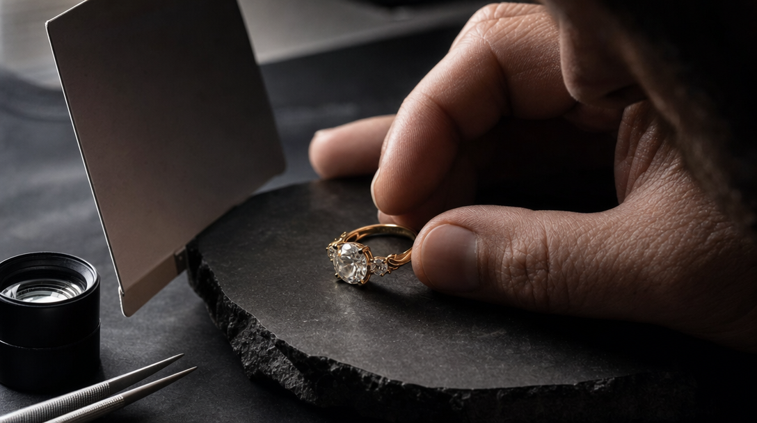
Take a high-jewelry ring launch as an example.
The map should not stop at "white diamond, yellow gold, luxury mood." It should say something operational:
the center stone must keep depth in three-quarter view, not only in frontal view,
the table can carry one crisp white source but cannot turn mirror-flat,
the yellow gold prongs may warm slightly but cannot outshine the stone,
the hand scene must preserve believable finger scale and natural pressure at the band,
the paid close crop must still show clean separation between center stone, side stones, and prong tips,
and the bridal hero can stay atmospheric, but the craftsmanship crop needs a cleaner proof lane.
Once you have that, the review room stops saying, "Can we make it more luxurious?"
It starts saying useful things:
"The center stone is louder, but it lost depth."
"The gold is carrying the frame and stealing the sale."
"This neck light flatters the model, not the sapphire."
"The hero works for aura; the crop still does not prove the setting."
That is the difference between aesthetic preference and production control.
Approve jewelry in three stations, not one gallery
Do not start with twenty polished frames. Start with three stations that each answer a different trust question.
Station 1: the black-tray truth check
Put the piece on a controlled dark surface with one disciplined lighting setup.
The job here is not romance. It is structural truth.
For a ring, you are checking:
center-stone depth,
prong logic,
band thickness,
metal contour,
and whether the light family feels coherent.
For earrings, you are checking how the stones separate from each other and whether the setting still reads as engineered instead of ornamental fog.
For bracelets, you are checking articulation and repeat consistency before the body context complicates anything.
This station catches the lie that styling often hides.
Station 2: the body-contact proof
Now place the jewelry on skin.
This is where the category becomes real or starts floating away.
A ring has to show believable finger scale, tension around the band, and a light relationship that still keeps the stone alive after skin warmth enters the scene.
A necklace has to prove where it sits on the collarbone, how the pendant falls, and whether the metal and stone still belong together when fabric, hair, and posture enter the frame.
An earring has to survive lobe contact, head angle, and shadow from hair without turning into a shiny sticker.
If the body-contact station fails, more sparkle will not save it. The asset is answering the wrong physical question.
Station 3: the commerce crop
Now crop like media and e-commerce will crop.
This is the station teams skip because it feels less glamorous. It is also where premium jewelry earns or loses trust fastest.
Run the piece through:
the vertical paid crop,
the tighter carousel crop,
the mobile PDP-support crop,
and one image that lives close enough to the product to expose weak setting logic.
For example, a tennis bracelet that looked elegant in a horizontal hero may show stone repetition that becomes synthetic in a vertical cut. A ring that looked poetic on a hand may lose its center stone completely once the crop tightens around the knuckle and warm skin starts dominating the frame.
The question is simple: does the jewelry still sell the intended proof surface after the crop?
If not, the campaign does not have an imaging problem. It has a routing problem.
Use AI for system breadth, not for every proof burden
Jewelry campaigns can absolutely benefit from AI.
AI is strong when the brand needs:
launch-world exploration,
editorial mood territory,
controlled visual families across formats,
fast concept branching,
secondary asset expansion,
or previsual testing before expensive capture.
The mistake is asking AI to carry every proof burden equally.
A smarter route is often hybrid.
Keep AI for:
the campaign world,
the secondary mood frames,
the visual system expansion,
the upper-funnel hero territory,
and the early variant board.
Switch earlier to hybrid or real capture for:
craftsmanship macro,
exact gemstone color behavior,
high-value bridal proof,
clasp or articulation detail,
and any crop where the buyer is effectively auditing whether the piece deserves its price.
If the team needs a broader decision rule for that boundary, the right companion is When AI Product Visuals Are Enough and When You Still Need a Real Shoot.
What Gateway Studio should remember after jewelry review
The model is not the memory. The review system is the memory.
For jewelry, Gateway Studio should keep:
the approved stone-light map,
the lighting lanes that preserved depth,
the metal behaviors that started stealing attention,
the skin contexts that kept scale believable,
the crops that remained proof-safe,
the exact rejection reasons by piece type,
and the moments where hybrid or real capture should take over next time.
That matters because jewelry campaigns branch quickly.
The same ring appears in launch stills, paid social crops, PDP support, bridal mood assets, founder review decks, and seasonal variants. If the team does not remember which light made the stone go dead, the next round will repeat the same error with stronger retouching and more expensive styling.
That is why the useful question is not: "Which prompt finally made the jewelry look luxurious?"
The useful question is: "Which light logic let the piece stay true across review, crop, and context?"
Jewelry ads fail in the light long before they fail in the prompt.
That is good news.
Light logic can be mapped. Review can be structured. AI can stay in the lanes where it creates real leverage. And the trust-critical surfaces can be protected before a premium piece is asked to sell itself through the wrong frame.
Because the first frame can borrow trust from styling and contrast, but the next angle reveals whether the stone still has depth, whether the metal is helping or stealing the light, and whether the piece behaves like one real object on skin and inside a paid crop.
Next move