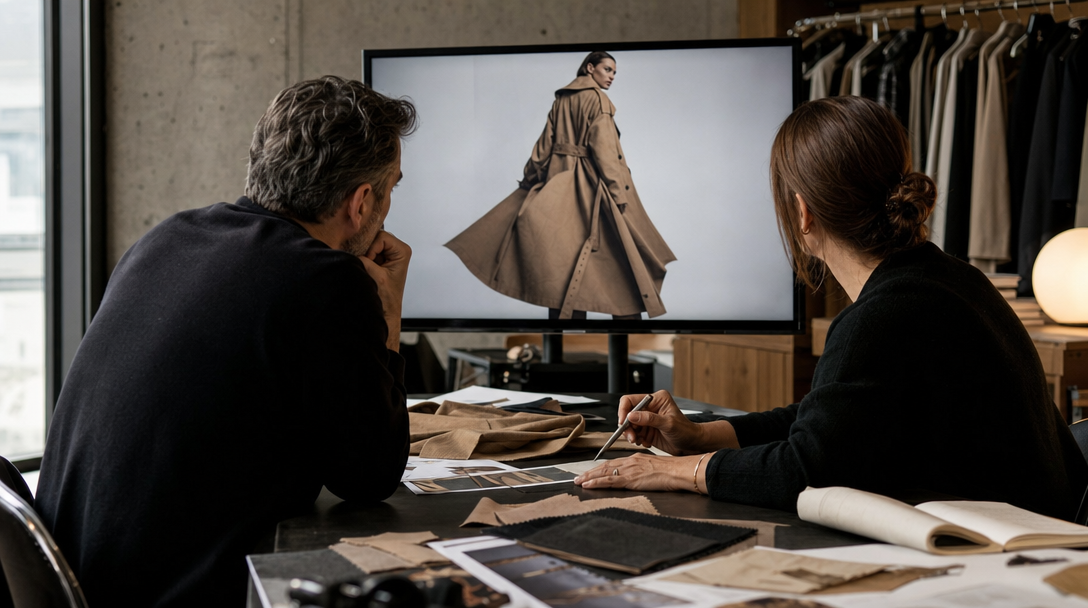
The room liked the first frame.
Soft shadow. Deep oxblood leather. One clean gold highlight on the clasp.
Then somebody picked up the bag.
The top handle stood up like molded plastic. The leather body stayed too full where weight should have pulled it down. The hardware looked expensive until it had to connect two parts that were no longer behaving like the same object.
That is the moment luxury handbag work usually tells the truth.
Not at the logo. Not at the hero crop. At the handle.
People do not need to collect bags to feel this. They notice when a bag no longer carries weight, memory, and tension like something a person could actually own. If the handle stands wrong, if the shoulder drop changes between frames, or if the edge paint starts looking decorative instead of finished, the visual stops feeling premium no matter how polished the styling is.
Gateway's view is simple: luxury bag ads are not won by surface glamour alone. They are won by carry truth.
Before a brand scales AI bag visuals, launch stills, social cuts, or campaign crops, it needs a control layer for handle tension, leather memory, hardware weight, carry mode, and the exact details that still need hybrid or real capture.
A luxury bag is read through load, not only through shape
In a still frame, many bags can look good for a second.
A clean silhouette helps. A beautiful leather color helps. A strong clasp or chain detail helps.
But luxury buyers do not really stop there.
They read whether the bag seems heavy in the right places. They read whether the structure belongs to the leather family being shown. They read whether the handle anchors into the body with confidence or just sits there as styling. They read whether the bag would behave the same way if someone actually set it down, picked it up, wore it on the shoulder, or opened it at a table.
That is why handbag work sits in an awkward space between product photography and fashion motion. It needs product truth and lifestyle desire at the same time.
Three common examples make the problem obvious:
A structured top-handle bag looks commanding on a dark pedestal, but the rolled handle rises too perfectly and never compresses where the hand would have touched it.
A soft shoulder bag looks luxurious in a waist-up fashion crop, but the strap drop shortens and thickens once the same bag moves into a paid 4:5 edit where the side profile is finally visible.
A crossbody launch visual sells the chain, the gloss, and the attitude, then loses trust because the hardware rings carry no believable weight and the leather body keeps the same shape no matter how it is worn.
Nobody has to say "the anchor point drifted." They will say something blunter: the bag looks fake.
The four lies teams approve too early
Weak AI handbag visuals usually do not get approved because the room is careless. They get approved because they are flattering in the first crop.
Then the same asset has to survive a closer read. That is where four predictable failures show up.
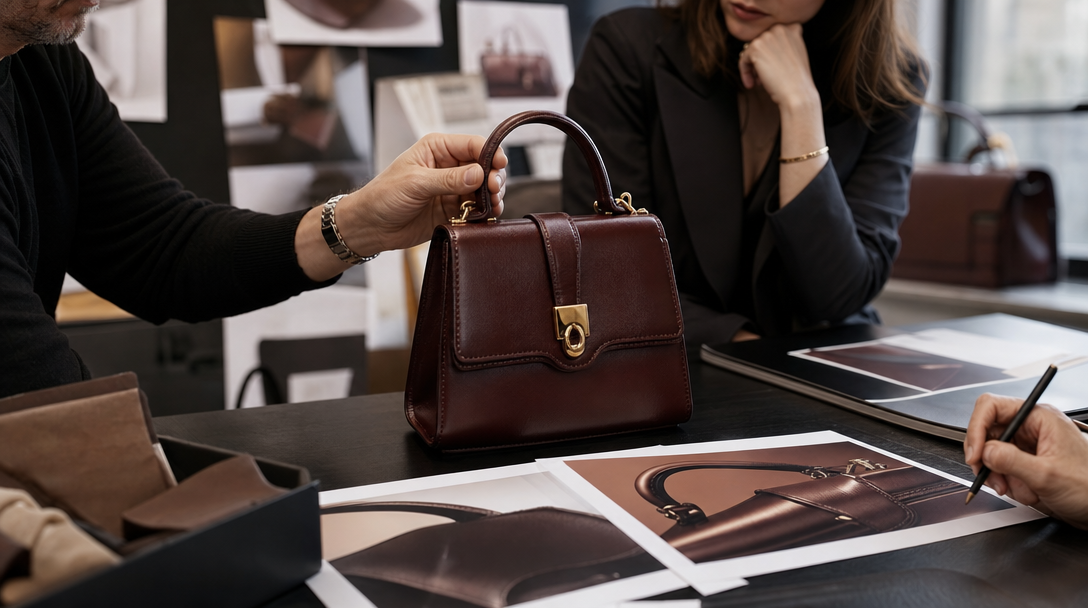
1. The handle belongs to a different bag than the body
This is the fastest trust break in the category.
The body may look expensive. The leather may even look convincing. But if the handle geometry says "light prop" while the body says "heavy luxury item," the visual splits in half.
Take a mini top-handle launch bag. The brand wants presence, so the art direction pushes for a proud upright handle and a sculptural silhouette. That can work. What does not work is a handle that stays uniformly round, never flattens at the contact points, and connects to tabs that look too thin for the weight the bag is implying.
Luxury bag buyers read this instantly. They may not name the construction issue, but they can feel when the handle is ornamental instead of structural.
2. The leather forgets what kind of leather it is
Soft leather is not just "less rigid." It remembers gravity differently.
Suede, pebbled calf, smooth box leather, padded lambskin, and coated canvas all collapse, crease, and catch highlights in different ways. If the bag body behaves like inflated foam in one shot and tailored leather in the next, the campaign loses authority.
Imagine a slouchy hobo bag. The hero still may look rich because the folds feel sculptural and the color grading is beautiful. Then somebody asks for a hand-carry cut. Now the base should pull, the side panels should change, and the opening should react to how the bag is being held. If none of that happens, the image starts reading like a prop shell.
That is not a niche fashion complaint. It is the viewer noticing that material identity disappeared.
3. The hardware shines, but it carries nothing
Luxury bag hardware is not jewelry garnish. It is a load-bearing promise.
The clasp, ring, buckle, zipper pull, and chain link all tell the viewer whether the bag was designed as an object or merely decorated as an image.
This is where many AI visuals become expensive wallpaper. The gold looks polished. The reflection looks cinematic. The close-up looks premium.
Then the D-ring floats. The chain sits without drag. The clasp edge softens. The zipper line bends in a way the opening could not actually support.
A review room might still say the shot feels "luxury." A shopper reads something else: the metal is pretty, but it is not doing any work.
4. The bag passes the shelf shot and fails the carry mode
A luxury bag almost never lives in one pose.
It needs to survive:
the tabletop hero,
the hand pickup,
the forearm carry,
the shoulder drop,
and often the open-bag or partially open detail.
Many assets win the first pose and lose the rest.
Example: a boxy satchel looks perfect in the hero still because the front panel, hardware, and handle are neatly aligned. Then it moves into a shoulder scene and suddenly the body does not rotate, the strap sits at the wrong angle on the coat, and the lower corner no longer responds to weight.
That kind of drift is lethal in paid use because media crops tend to force the bag into a more functional read than editorial hero shots do.
Separate aura shots from proof shots before the campaign starts
Bag campaigns go soft when every image is asked to do every job.
It is better to split the visual system early.
Aura shots
These sell desire.
They establish the emotional world around the bag: night-out confidence, quiet wealth, gallery-day ease, airport authority, or winter tailoring.
Examples:
a top-handle bag resting beside a wool coat and leather gloves in low window light,
a shoulder bag half hidden under dark hair and a sharp black blazer,
a compact evening bag catching one hard reflection on a marble counter before the owner even reaches for it.
These frames matter. They tell the brand story.
But they do not have to answer every construction question.
Proof shots
These defend the bag as a real object.
Now the campaign has to show:
handle attachment,
strap drop,
leather memory,
hardware logic,
opening behavior,
and one believable family of light across all major surfaces.
If the asset is meant to help justify a higher price bracket, the proof shot cannot hide behind shadow and mood forever. It has to show that the bag still belongs to the same object once somebody touches it, carries it, or looks closely at the opening and hardware.
Hybrid campaigns
This is often the smartest route.
Use AI for the world, the atmosphere, the hero styling, the secondary crops, and the wider launch system. Use hybrid or real capture for the details that bear the trust load.
For a luxury handbag launch, that may mean:
keeping the AI hero still,
keeping the editorial shoulder portrait,
keeping the campaign layout assets,
but switching to real or hybrid capture for the hand pickup, the hardware close-up, the opening behavior, or the carry-mode transition that proves the bag is worth its price.
That is not conservative thinking. That is knowing where the product starts speaking louder than the styling.
Build a carry-truth board before you prompt
Moodboards are not enough here.
The more useful control object is a carry-truth board. It should sit next to the references before any full render set is approved.
Lock:
the exact bag family and size,
whether the body is structured, semi-structured, or soft,
top-handle behavior under rest and under lift,
approved strap or chain drop ranges,
anchor-point logic,
hardware family and finish,
zipper or flap opening truth,
leather memory and crease zones,
edge-paint thickness and stitching priority,
which carry modes the bag must survive,
which shots may stay atmospheric,
and which shots still require reality.
For example, a structured luxury tote board should not stop at "burgundy leather, polished gold hardware, old-money mood." It should say:
the handles may stand, but they cannot stay perfectly cylindrical under grip,
the body must hold architecture at rest and release slightly under lift,
the shoulder drop has to lengthen naturally over a wool coat,
the front panel can take one strong highlight but the side gusset cannot turn into glossy plastic,
and the paid 4:5 crop must still prove opening, edge finish, and handle attachment.
Once the room has that board, the conversation gets sharper.
Instead of "make it feel more expensive," the team can say:
"The handle is too weightless for this leather class."
"The D-ring is glossy but not load-bearing."
"The shoulder carry is flattering, but the base is no longer reacting to gravity."
"This works as aura, not as proof."
That is the level where handbag review becomes useful instead of decorative.
Run three review frames before the full set
Do not begin with twenty images. Begin with three controlled tests.
Test 1. The authority still
One tabletop or pedestal hero frame.
Question: does the bag belong to one believable construction and one believable light environment?
Check:
silhouette,
panel behavior,
handle geometry,
first hardware read,
and material identity.
Test 2. The hand pickup
Now force contact.
This is where many bag visuals stop performing. The moment a real hand enters, the bag has to prove grip pressure, handle compression, body response, and opening stability.
If the hand pickup fails, the campaign does not really understand the product yet.
Test 3. The real carry mode
Pick the carry mode that matters commercially: top handle, shoulder, crook-of-arm, crossbody, or clutch.
Then test only that one properly.
For a shoulder bag, the viewer should be able to read strap length, drag, body swing, and whether the bag still feels desirable once it behaves like a thing someone owns instead of a museum object floating in perfect posture.
What Gateway Studio should remember after the review
If the review is good, do not reduce it to "approved" or "rejected."
Store:
the carry-truth board,
the accepted handle behavior,
the banned anchor-point drifts,
the hardware close-ups that survived scrutiny,
the carry mode that still needs real capture,
the crop-safe proof surfaces,
and the exact reason a luxury-looking frame was still not commercially safe.
That memory matters because bag campaigns rarely stop at one hero still. They branch into paid social, launch pages, PDP support, short motion, lookbook crops, and founder review rounds. If the team forgets what the handle was allowed to do, the same mistake comes back wearing a better grade and a stronger shadow.
Luxury handbag work gets better when the room stops asking only whether the bag is beautiful.
Ask whether it can be carried. Ask whether the leather remembers what it is. Ask whether the hardware is holding weight or only catching light.
That is usually where the fake version ends and the premium one begins.
Because the hero still can borrow trust from styling, shadow, and color, but the next closer read reveals whether the handle, leather, hardware, and carry mode still behave like one real luxury object.
Next move